Or as I’ve started calling it: PSYCHA. Why? No idea. I think I probably made a typo somewhere and it just stuck in my brain.
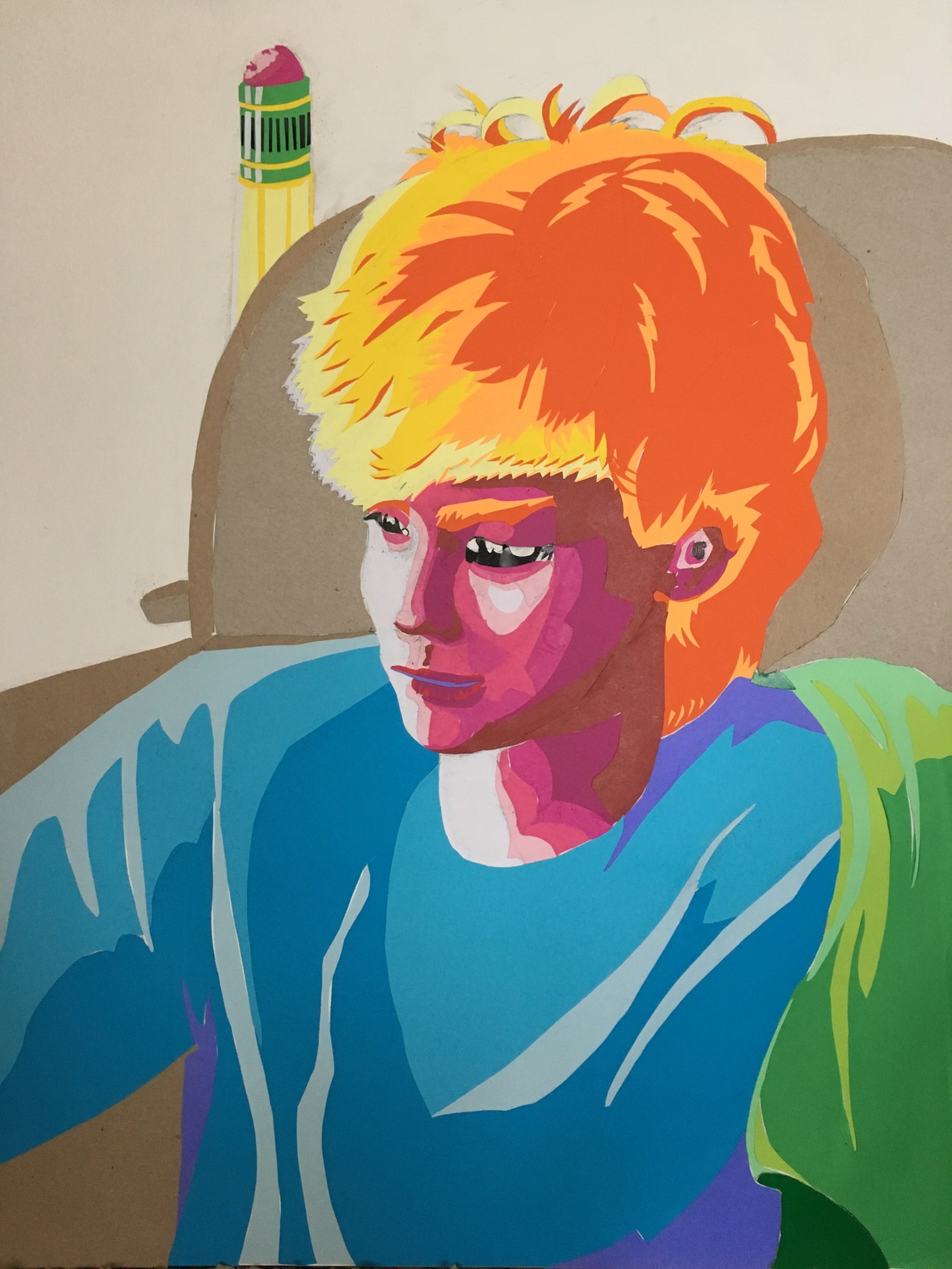
Anyways, I made this PSYCHA portrait of my brother/apprentice, Lance. Since portraits aren’t my specialty, I did lots of sketchbook tests before I committed to anything on my larger paper.
Unfortunately, the first sketch does not portray my brother’s psyche. It portrays my brother’s psyche after consuming eight consecutive lemons.
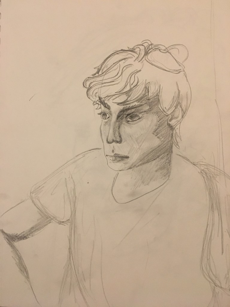
(I mean, seriously though, what is that face?) 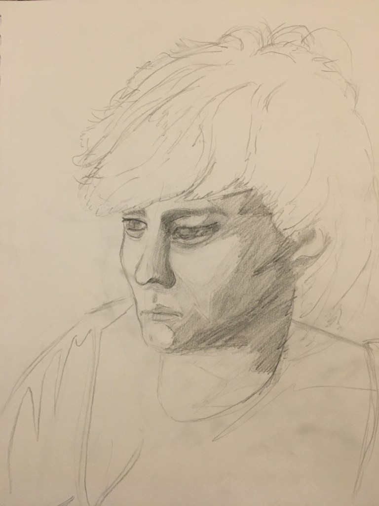
Next drawing was better, but still a little off-the-mark.
At this point, I realized my hasty shading was letting me down, so I instead focused on breaking down the face into a handful of core values.
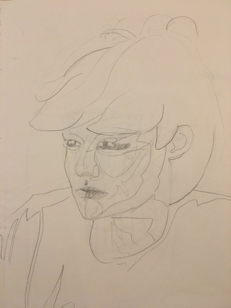
Yeah, there we go. Way better. 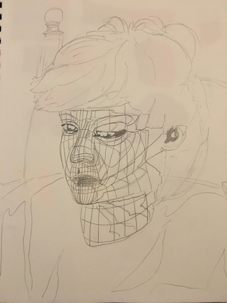
This was a scrapped concept involving 3D facial topology. Lance and I are both avid 3D modelers, so this seemed like a good idea until I saw how it looked on paper.
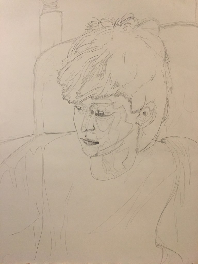
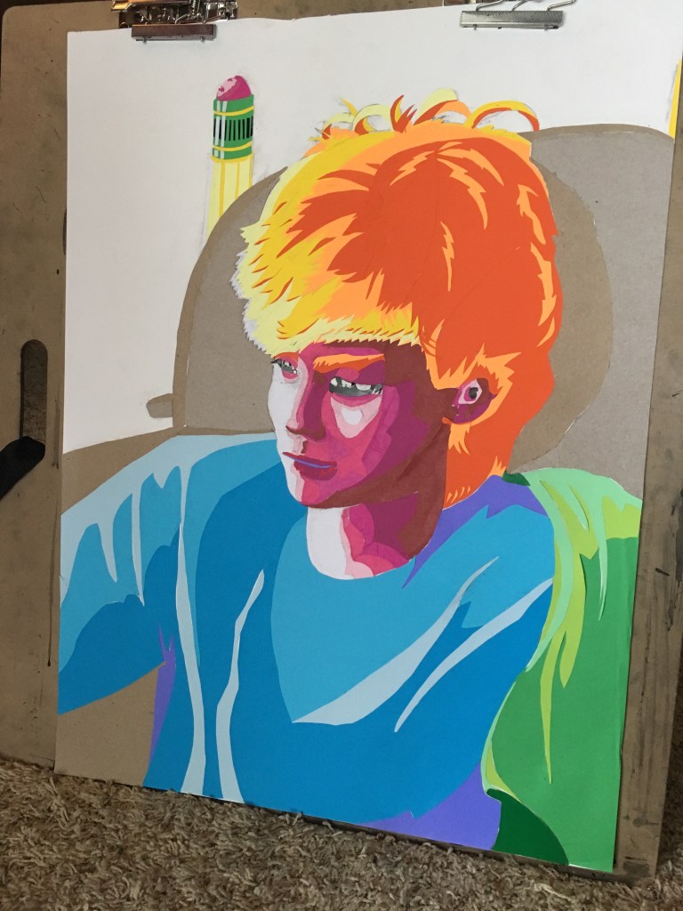
Using the purely contour test as a reference, I finally did a sketch on the big paper (18×24″).
Next step: collage time. This is where the real pain begins.
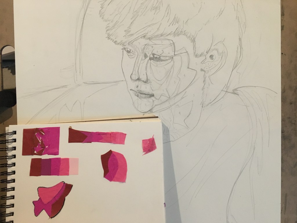
I did a bunch of collage tests 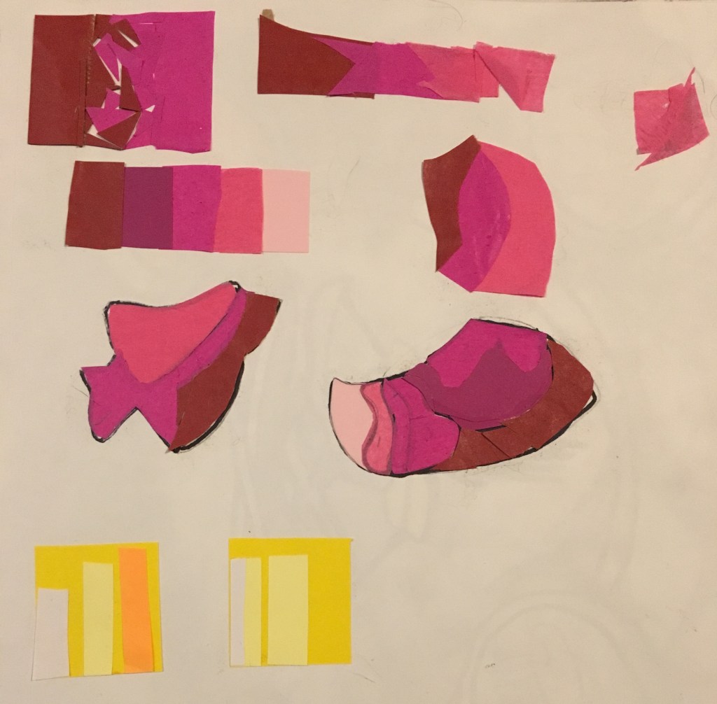
to find the best layering method. 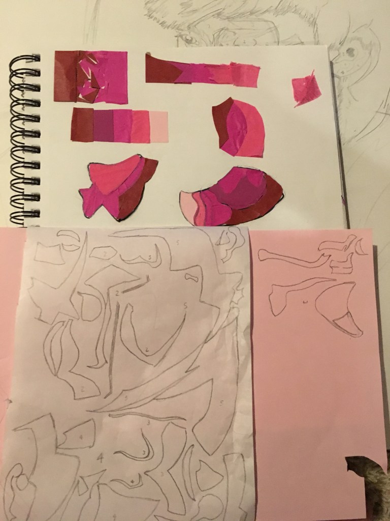
Then I used a makeshift lightbox to transfer lineart from the sketch onto parchment paper… 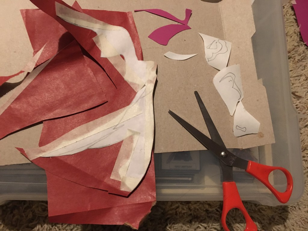
to make stencils! These things were a pain to cut out.
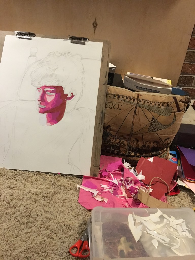
Here’s the fruit of all that labor: one freshly concocted magenta face and a whole lotta tiny paper scraps.
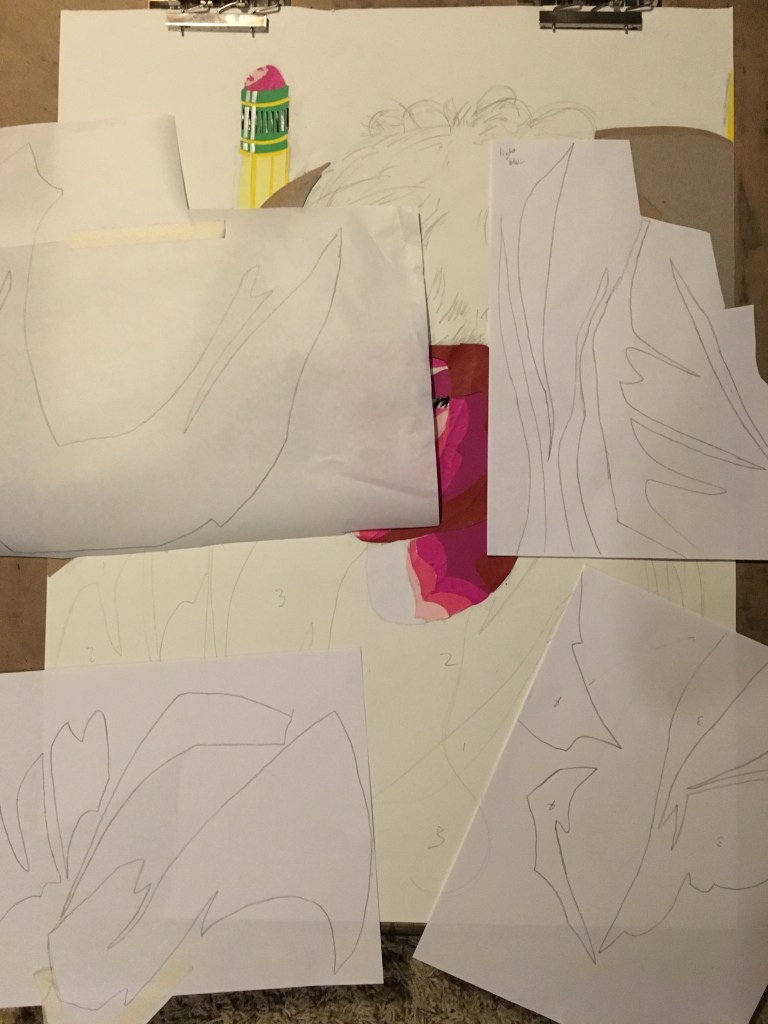
More stencils 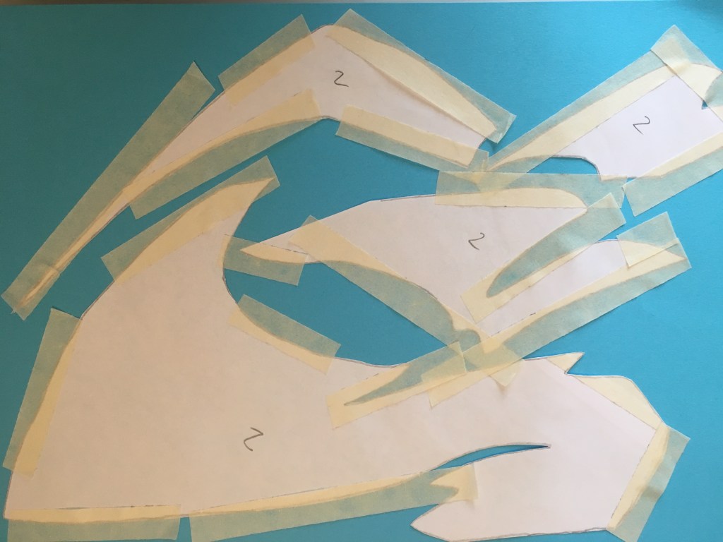
Cut ’em out 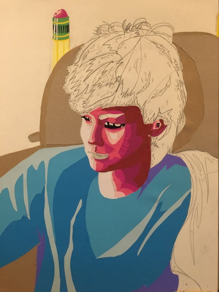
Bam. Shirt. Also a background!
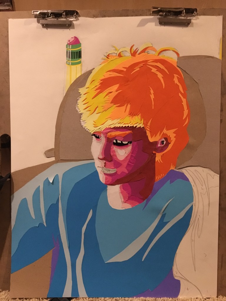
Next up: the hair. The hair was super tricky and went through a few iterations before I got to the final result. Then I added the shoulder drape and lips and that was that!
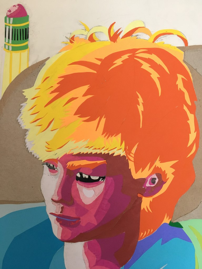
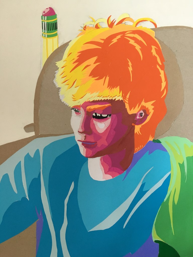
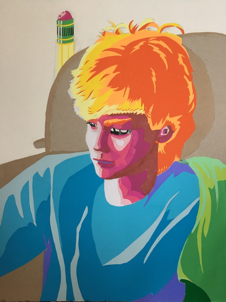
I’m really happy with the way it turned out. The key to achieving success with this style was definitely focusing early on breaking down shapes into core values. I limited myself to no more than five values on any given object (you can see some of my number notes on the sketch and stencils in previous pictures). This was partly because of limited materials to make the collage with, but also because it forced this “toony” style, which fits Lance very well. I also kept almost all the warm colors in the image focused on the head (which is also where the most detailed areas are) to ensure that the face itself remains the focal point of the artwork.
While I was working on this, Lance commented that it looked like something Picasso would do. I disagreed with him because Picasso’s portraits tend to be much, much more abstracted than this one.


While they may share the same lurid color scheme and clean edge lines as my PSYCHA portrait, their emphasis is completely different. Picasso is trying to portray the inner feelings of his subjects by drawing his perception of their emotional state, while my approach was more focused on using an abstract style to mimic the natural expression of the subject as closely as possible. Picasso also tends to work with large blocks of color and focus less on value, which was a huge part of my Lance portrait.
What I’m Listening To:
What I’m Listening To is what music I’m listening to while I make art.
