
The Final Project for Drawing II involved using multiple media types in combination to create a cohesive Mixed Media piece. Finally, a chance to use everything in my art box!
My initial concept was a tower surrounded by an inkstorm with various worlds and dimensions suspended within the maelstrom.
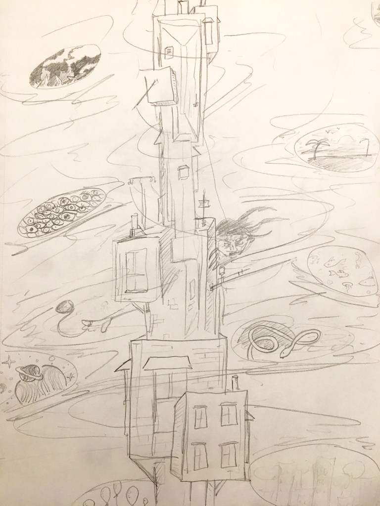
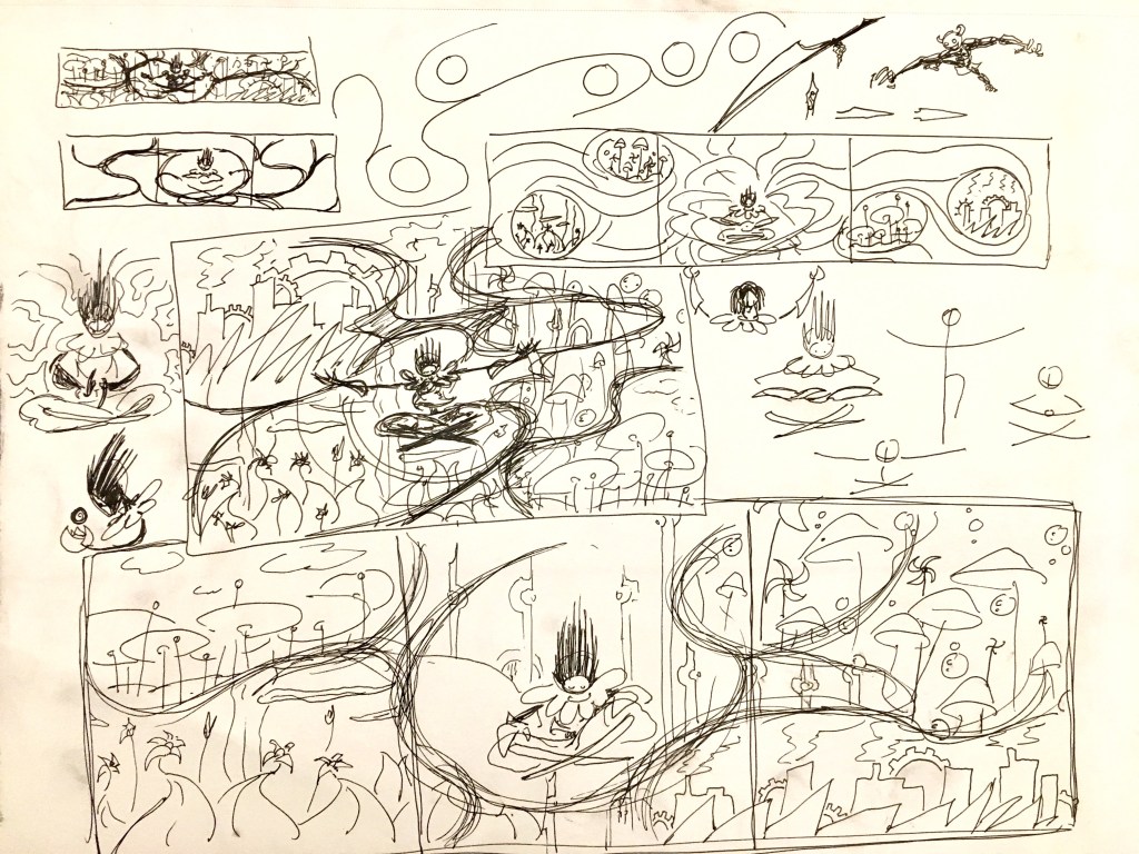
Original concept design 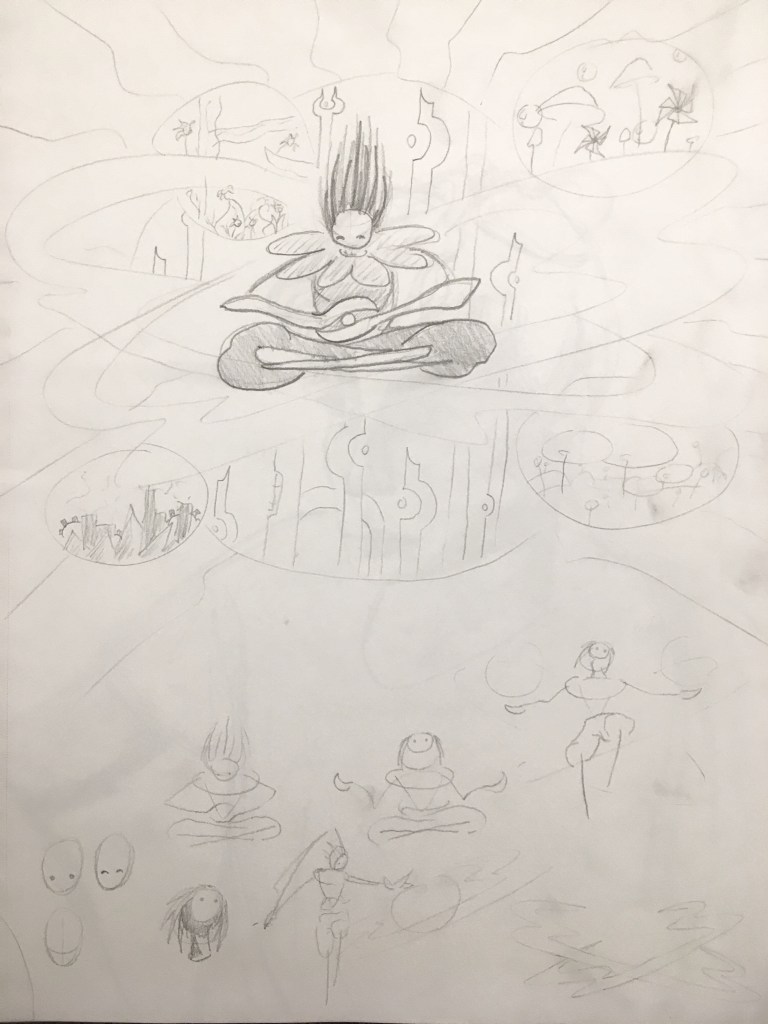
Second concept design
However, I ended up pursuing a variation on this idea with a more specific theme:
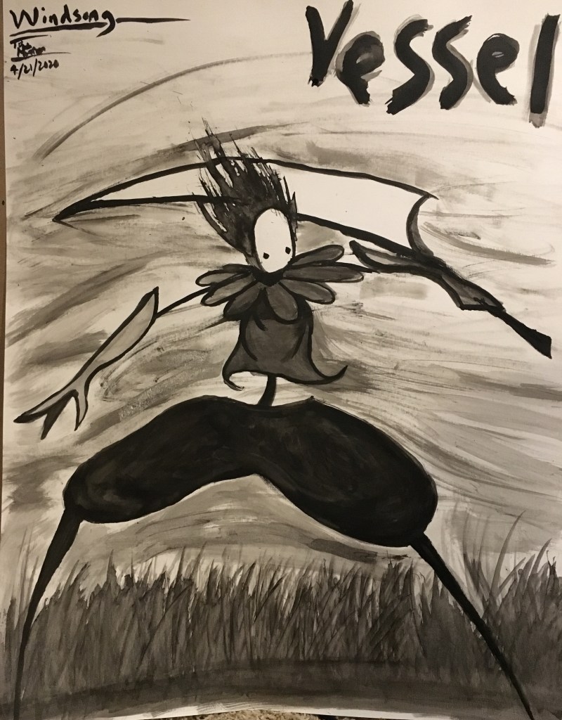
Windsong
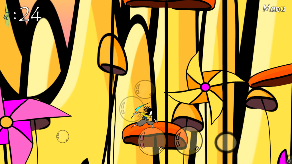
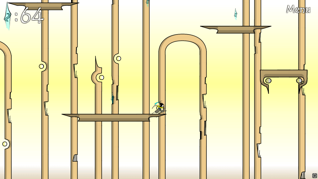
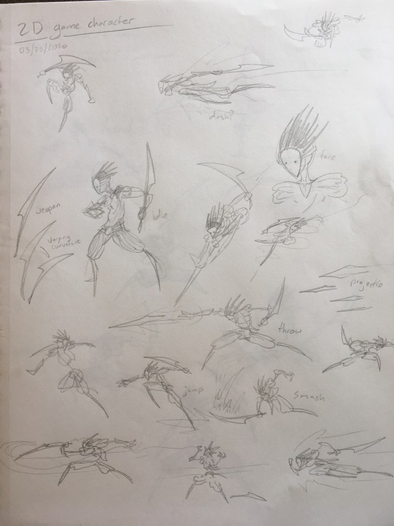
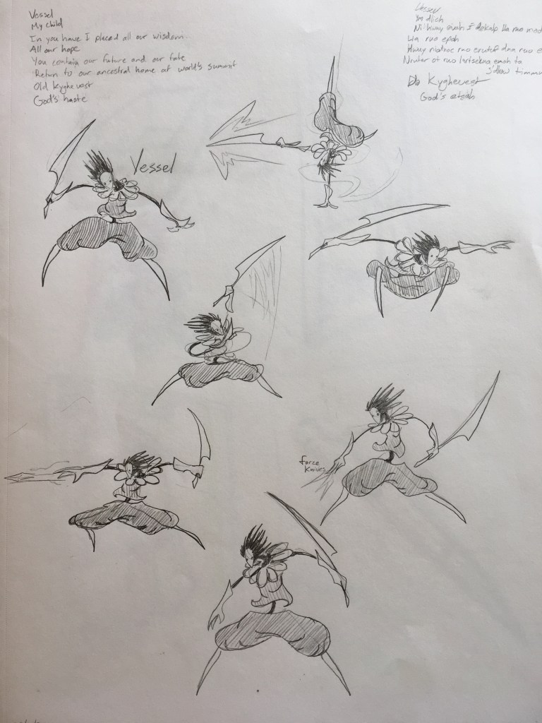
Windsong was a 2D side-scrolling platform game I had created earlier in the semester:


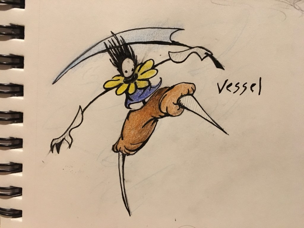
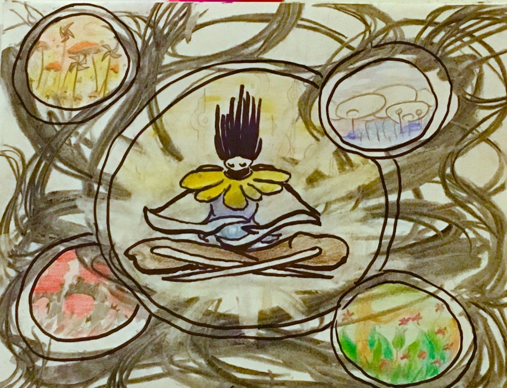
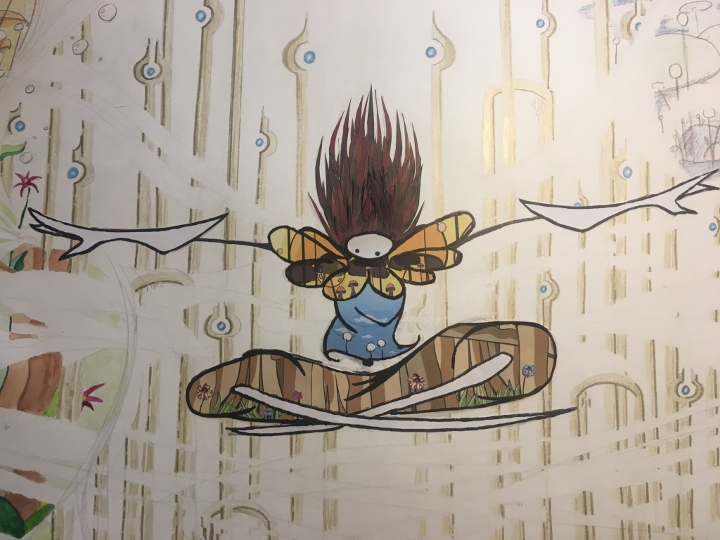
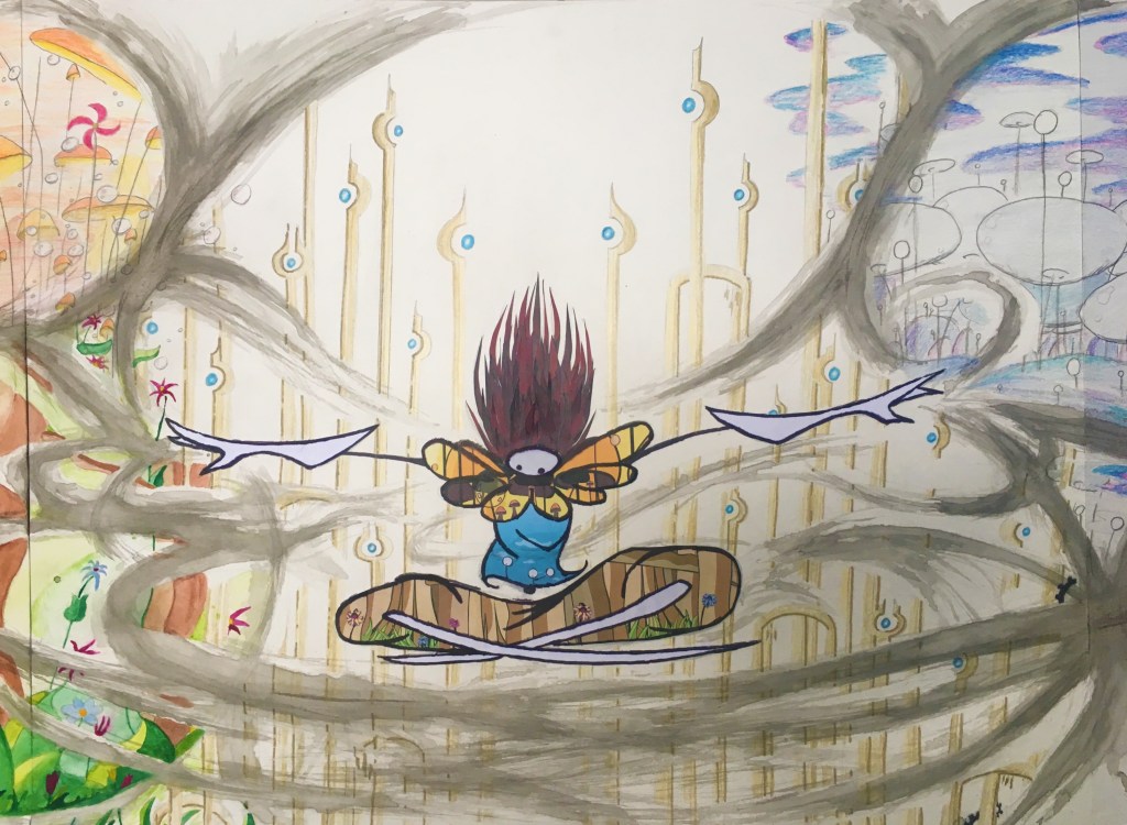
The updated Mixed Media concept involved Vessel (the main character from the game) replacing the tower at the center of the picture and the worlds suspended in the vortex representing the five different environments from Windsong.
Composition studies 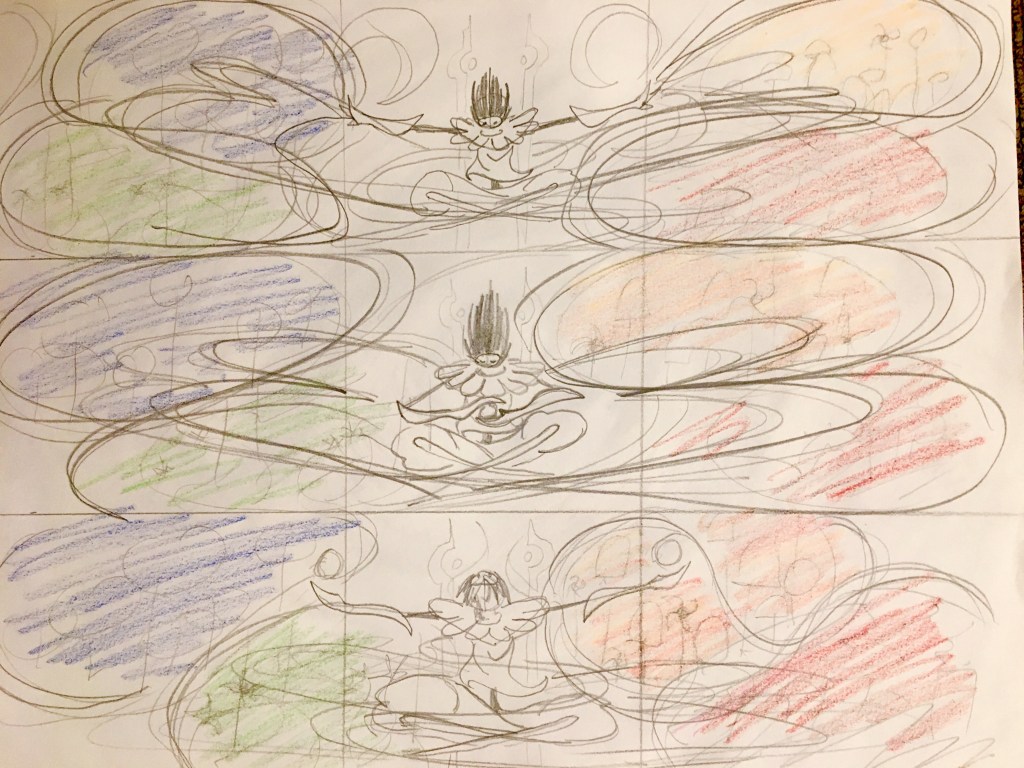
Pose studies 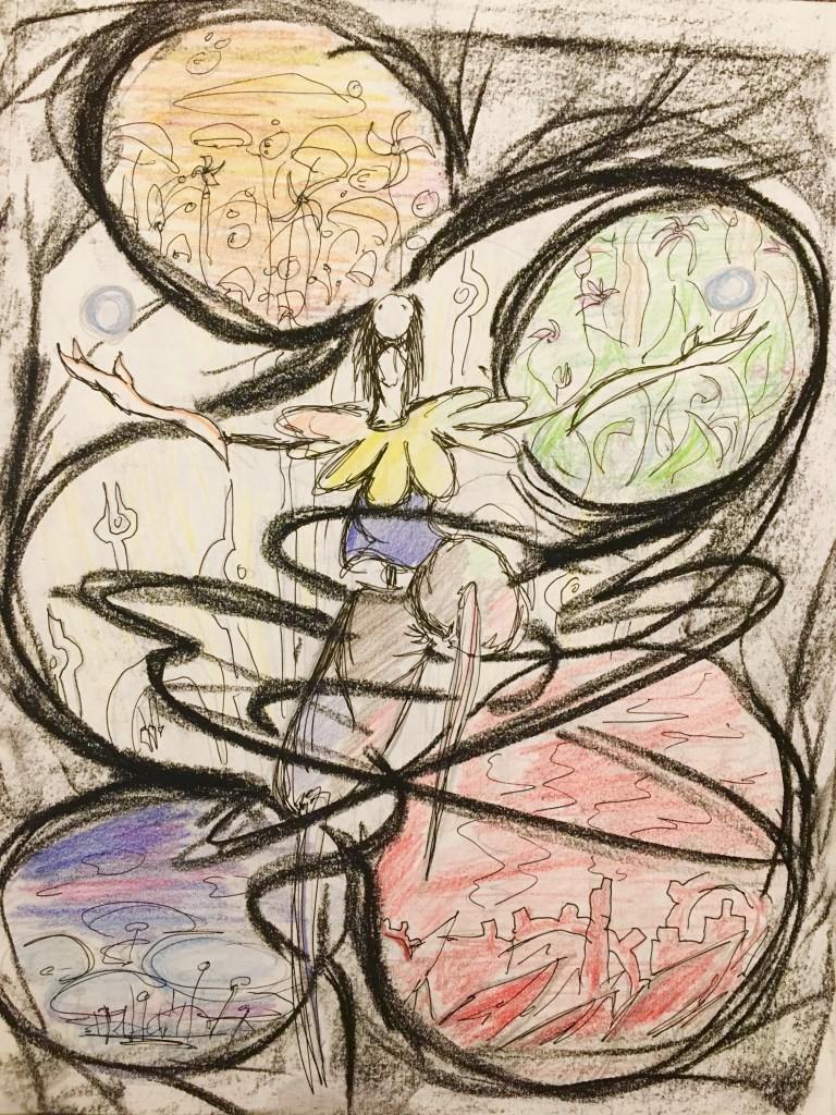
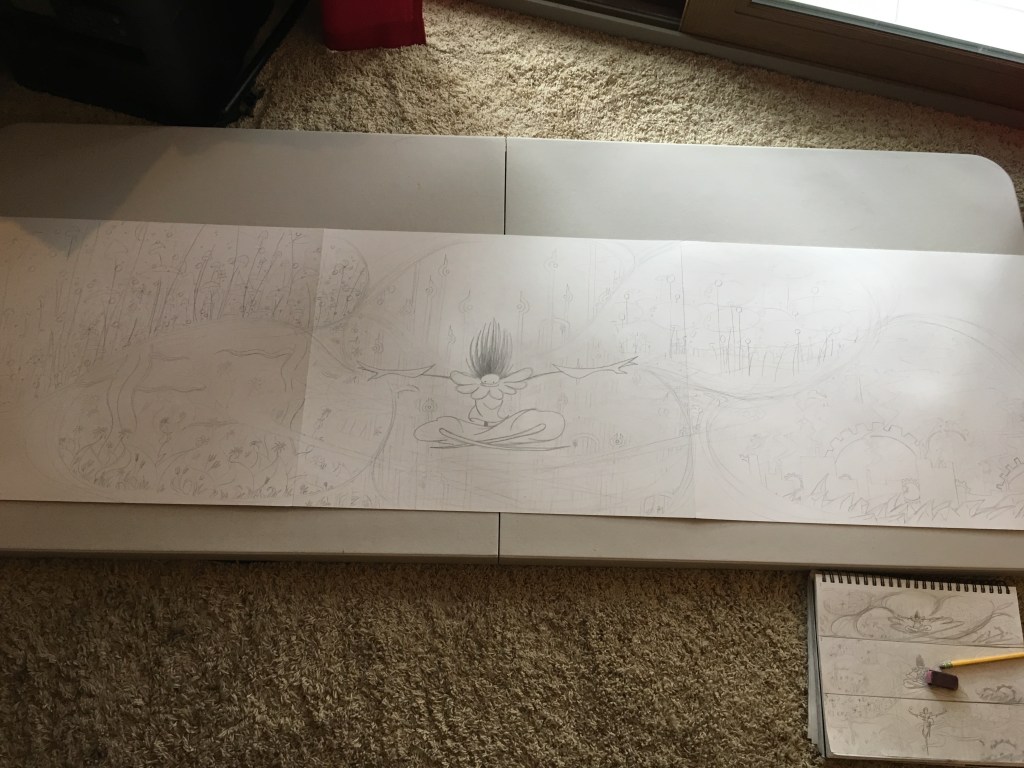
Vertical composition 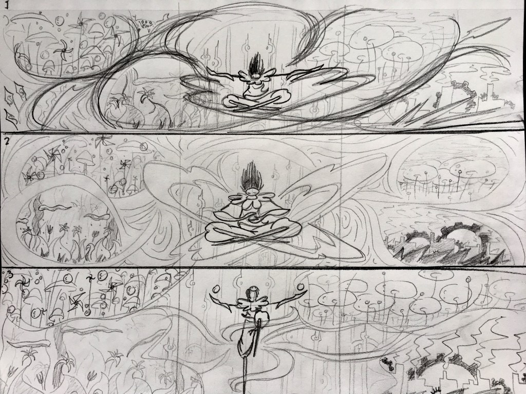
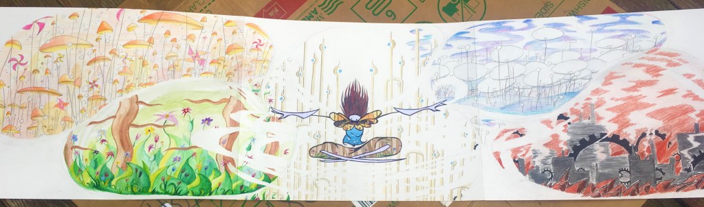
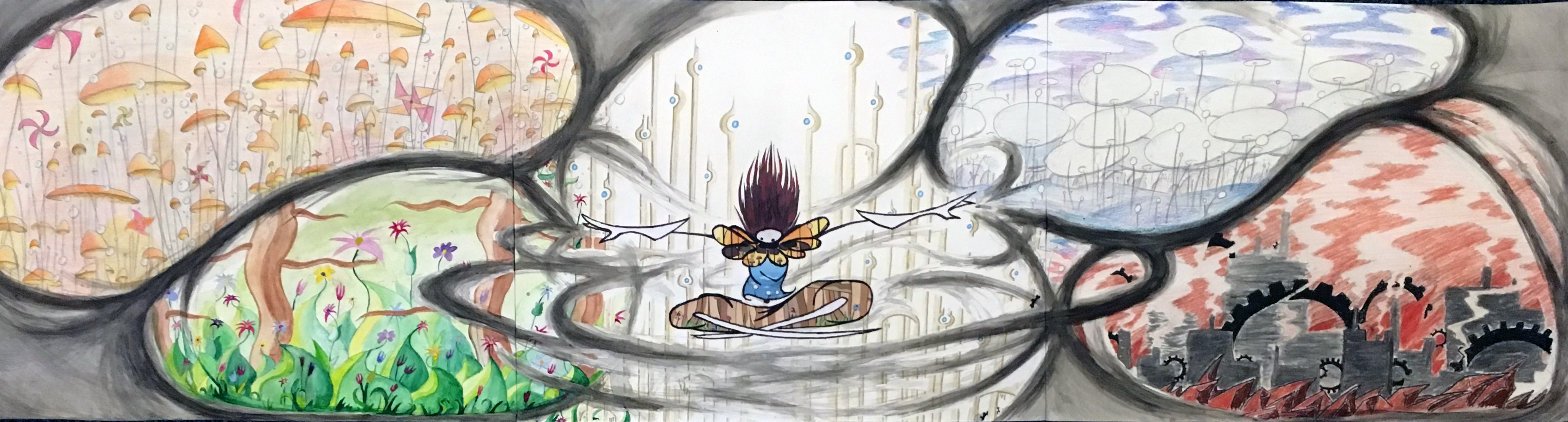
Early on, I realized I wanted to use three 19″x24″ Bristol board sheets instead of one to create this piece. Trying to fit the composition into one sheet felt too squished to me and I liked how the longer format opened it up.
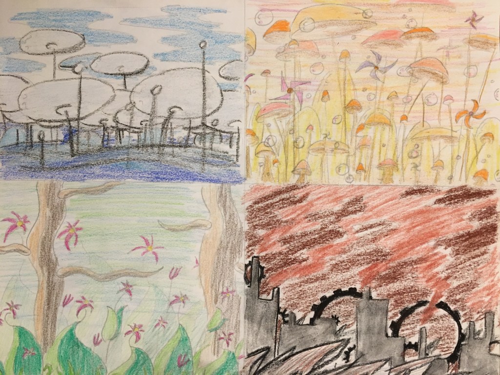
I did lots of material tests to find exactly what media and color palettes to create the worlds with. Watercolor paint for Green, crayon for Blue, colored pencil for Orange and Gold, and charcoal + sanguine for Red.
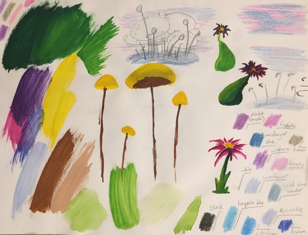
paint & crayon tests 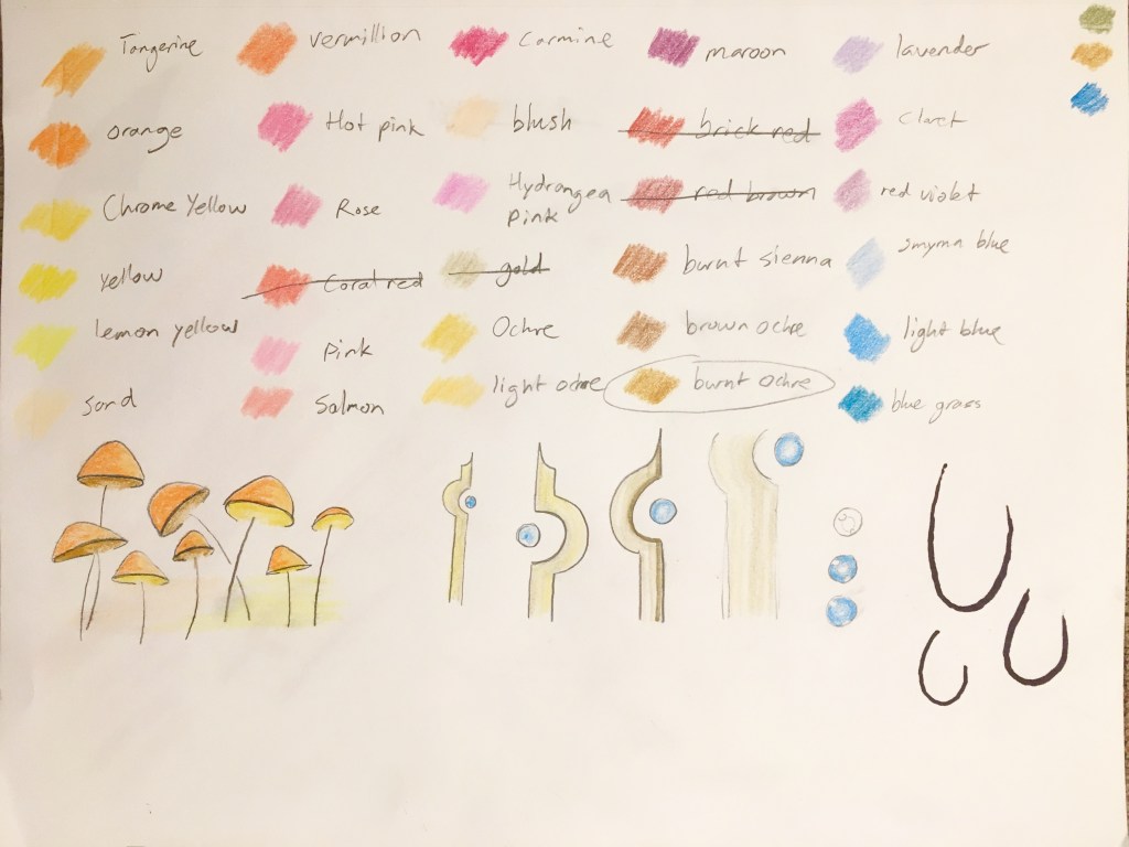
Colored pencil tests 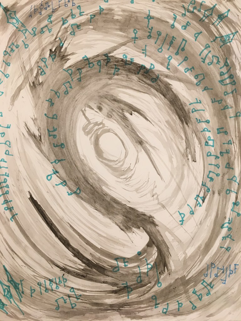
Ink maelstrom test with Sharpie music notes
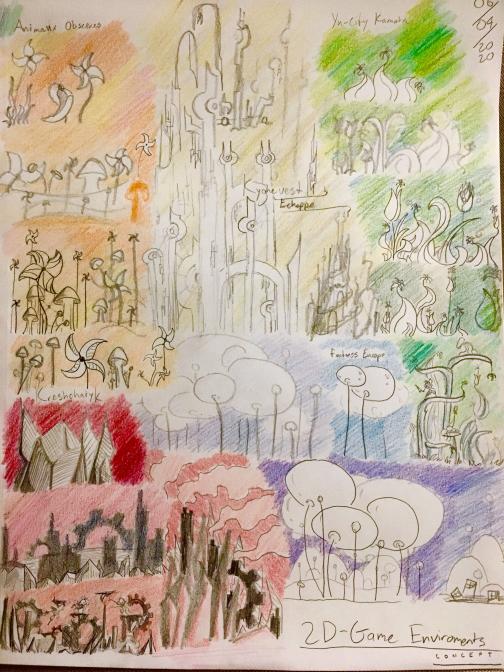
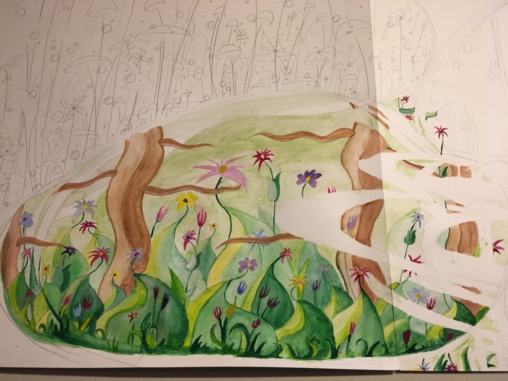
First, I painted Green World (the visuals of which were inspired by Dan Bodan’s music track “Yu City Kamata“, which was also Green World’s background music in-game). This was my first time using watercolor paints (and one of the first times I’ve painted on paper in a very long time), so I’m reasonably happy with how it came out.

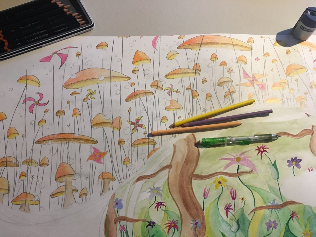
Next: Orange World (Dan Bodan’s “Animaux Obscenes” was the inspiration for this one) using colored pencils (I also did Gold World (“Échappé”) at this point).
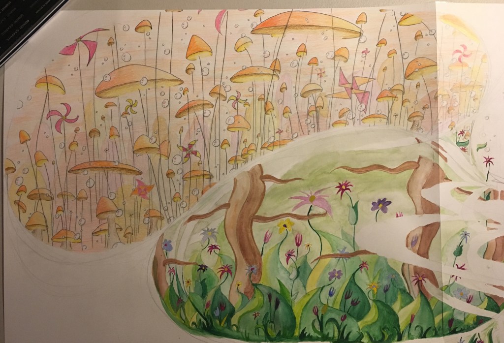
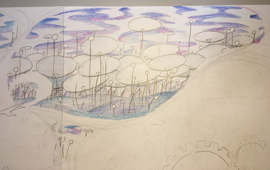
Blue World (“Fortress Europe”) with crayons:
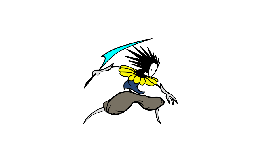
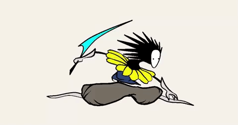
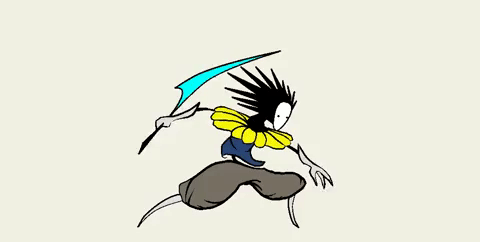
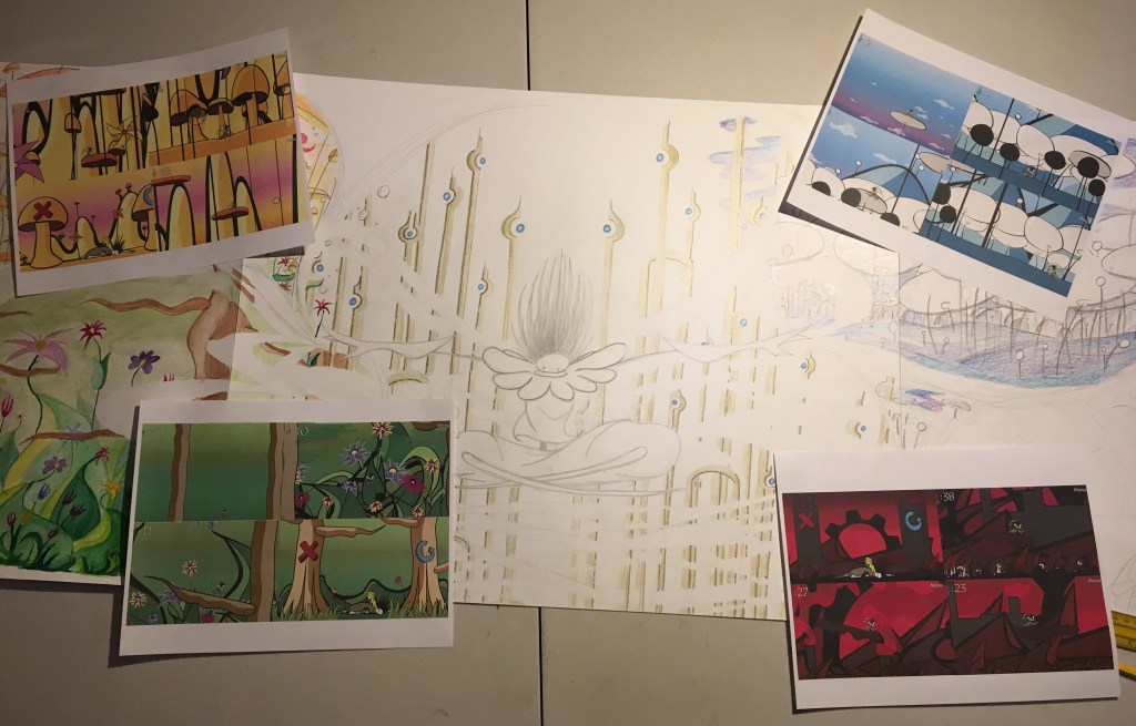
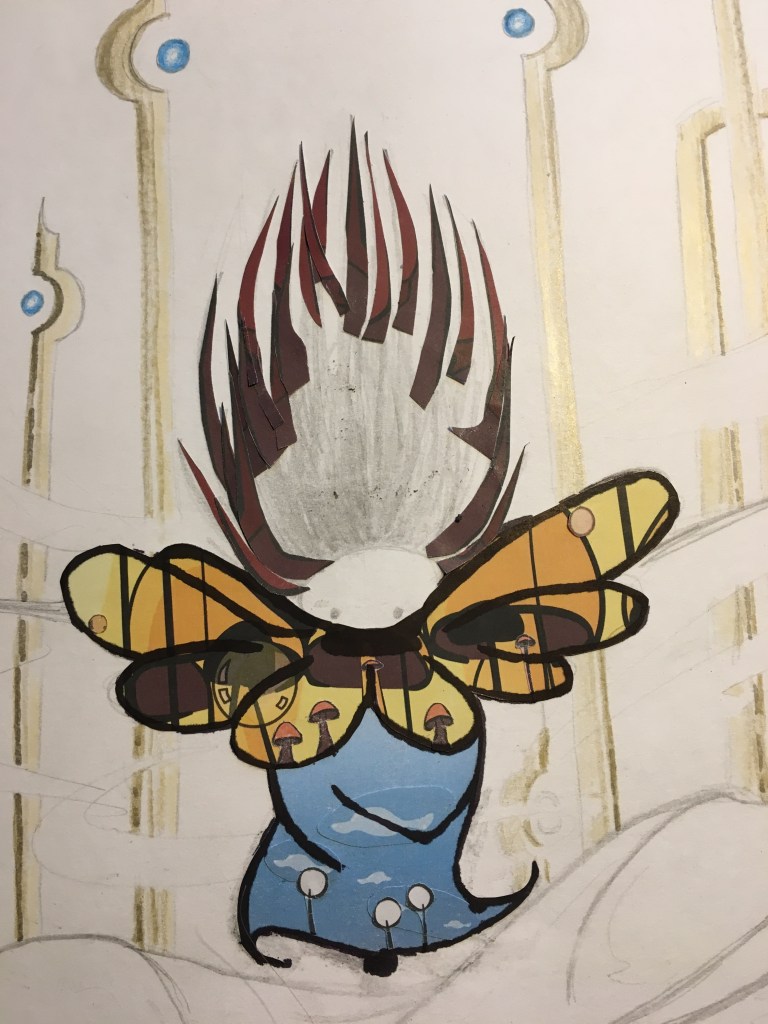
Then, before I could do Red World, I had to put in the central figure. I made Vessel using screenshots from the game in a collage. The spiky rocks of Red World became the hair, the whimsical mushroom forest of Orange World made up Vessel’s yellow collar, Blue World was a natural fit for his blue shirt, and for his baggy pants, I used the trees from Green World. Vessel’s legs, gauntlets, and mask were made from plain white paper to avoid looking too busy. When the whole collage was assembled, I drew the black cartoon outlines back on using a brush tip Sharpie.
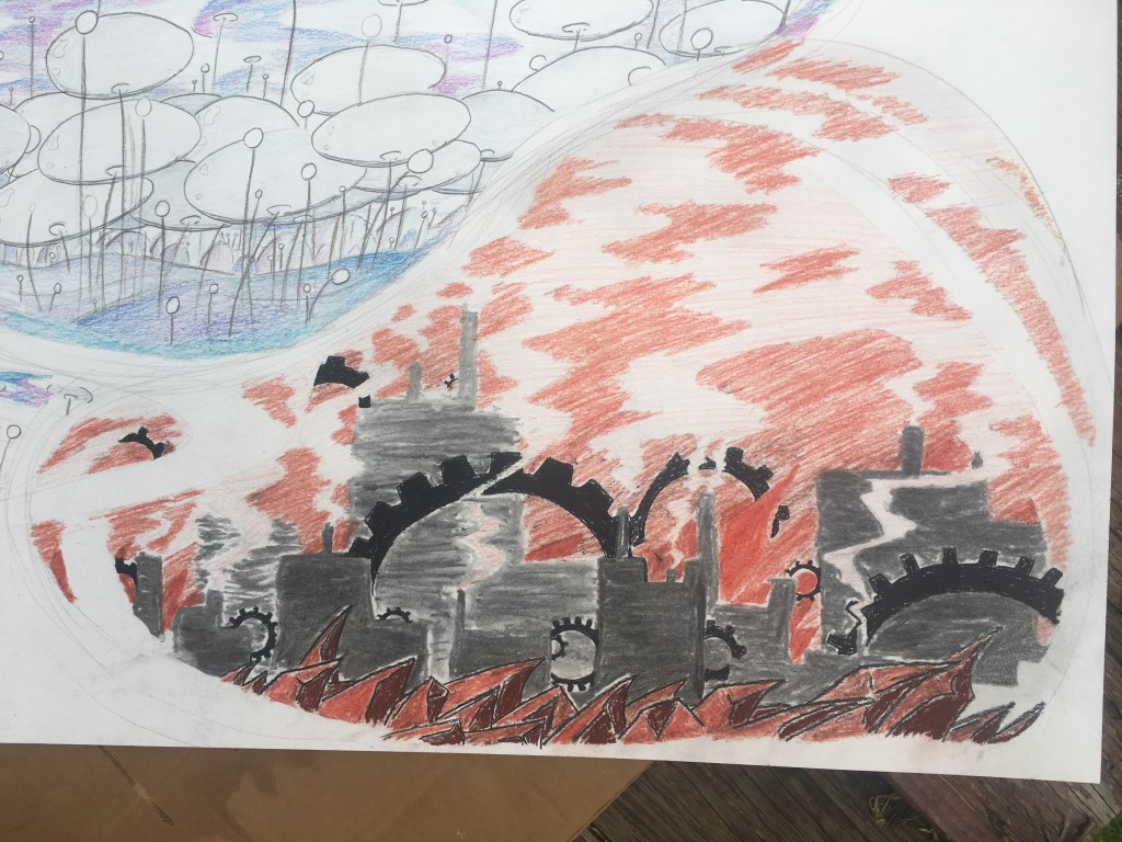
Finally, I put in Red World (visuals inspired by Dan Bodan’s “Kreshchatyk”). Red World had to be done last since it was all charcoal, sanguine, and conté, all easily smudgeable materials. It was also in the lower right hand corner, right where my arm tends to rest when I’m working on a drawing. Bad combination!
With the character and all five worlds finished, I sprayed the entire drawing with a coat of workable fixative to ensure the inking in the next phase wouldn’t damage anything.
Time for ink! I mostly used custom-built brushes for this.
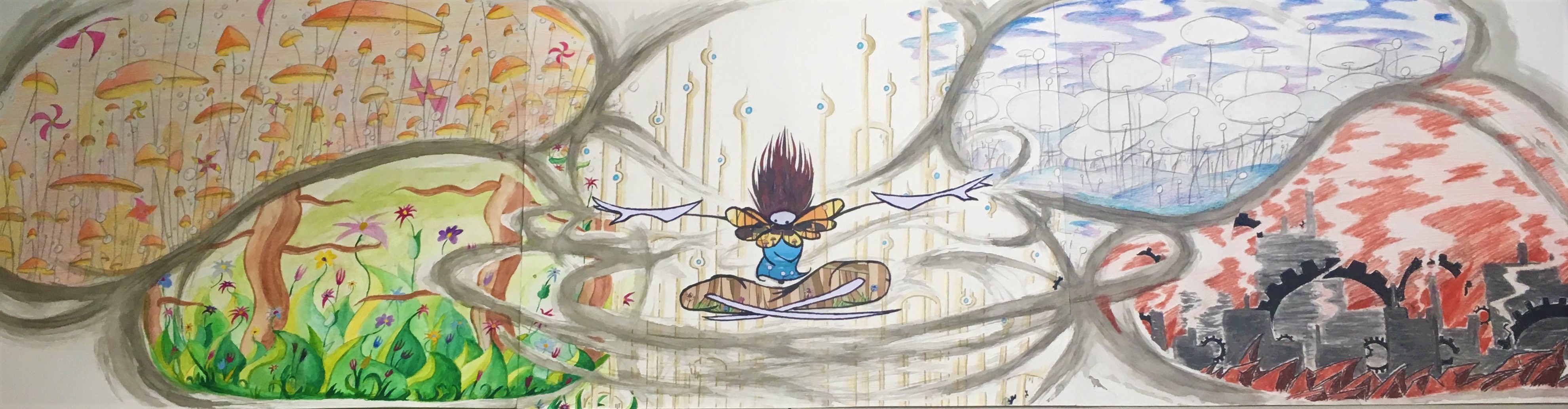


Later on, I felt the drawing was unfinished and made some adjustments to bring it more in line with my original vision. The plain white corners seemed too empty to me and I also felt they detracted from the focus on the center of the image, so I filled them with a grey inkwash to ensure the center was the brightest point in the whole picture. I also greatly darkened the windpaths to create more contrast. Finally, I filled in the grey corners with blue Sharpie music notes and Echo Crystals (collectibles from Windsong).
Inkwash added, but no crystals or notes yet 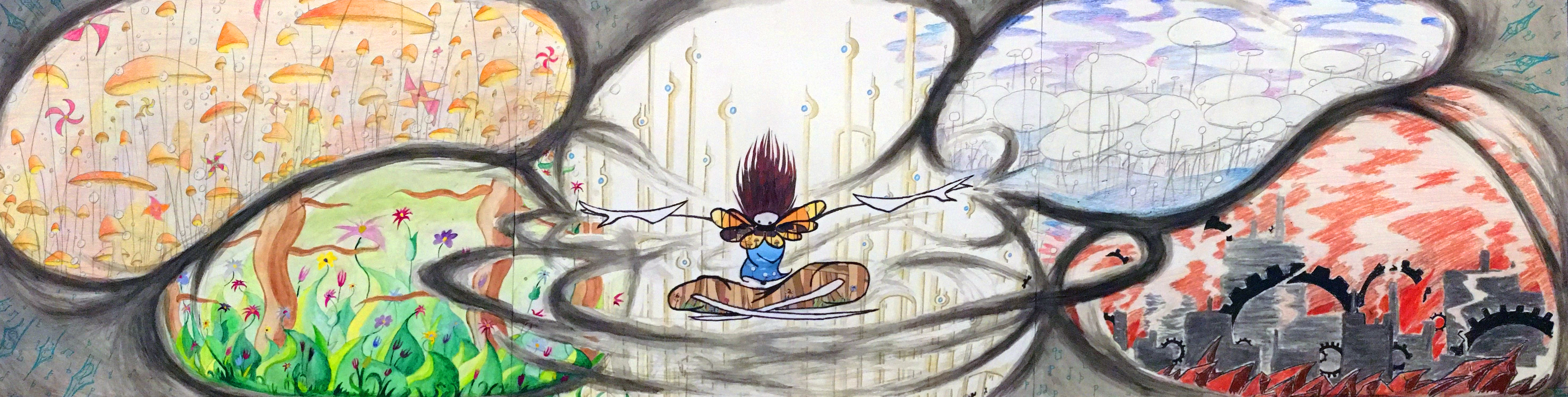
The resulting 6′ behemoth is stunning! The viewer has to physically turn their head to see everything! I’m very happy with this piece; I think the longer composition was the key and following it through really made this design work. I also played a lot with the position of each world based on their color and shape language and I think any other arrangement wouldn’t have looked so correct.
Overall, I think this piece was a great send-off to the semester. It’s huge, it incorporates a lot of techniques, concepts, and tools that were covered in Drawing II, and, most importantly, it represents exactly what I wanted it to. Windsong was a wonderful project to work on and getting to revisit it for this piece was a very rewarding experience.
(If you’re interested in playing Windsong, you can find it here. Simply download the .zip folder, extract it’s contents, and run Windsong.exe.)
What I’m Listening To:
What I’m Listening To is what I’m listening to when I make art.
