
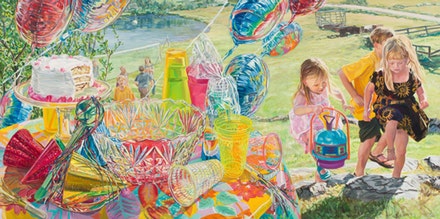
(& Janet Fish)
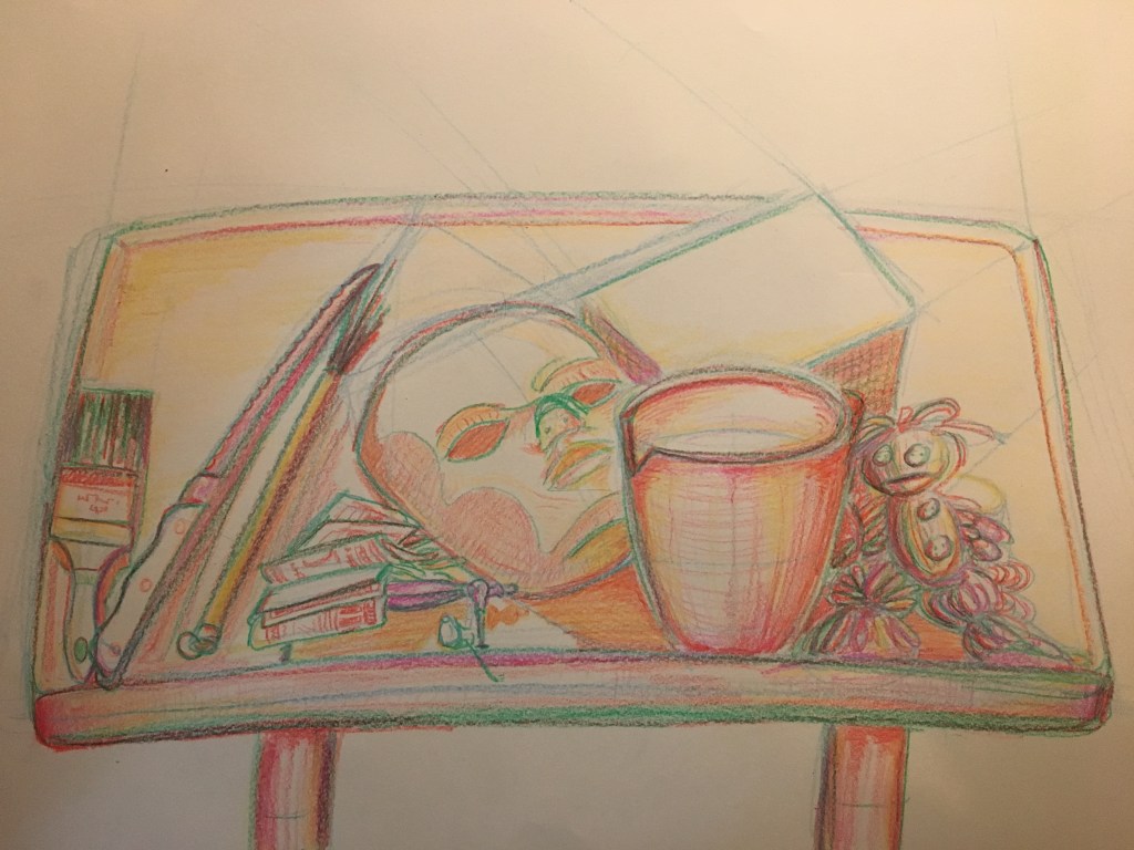
This still life explores a very unique approach to contour study. Color is incorporated into the design of this piece, but not in a traditional sense. Each layer added to the drawing is drawn in an increasingly warm hue, with the gestural start and perspective mapping being cold blues, the initial linework green, the early detail and volume-defining layers yellow and orange, and the finishing touches in red and violet.
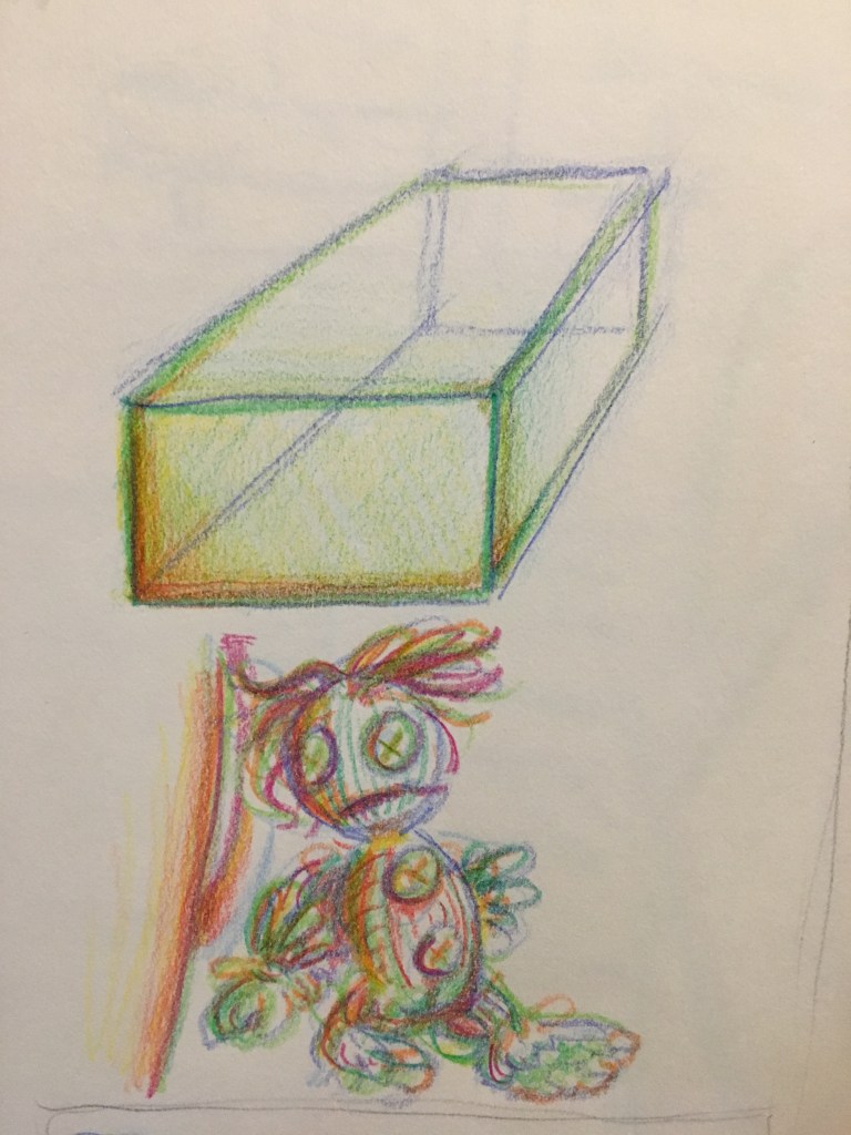
This technique creates a very unusual, chromatically abstract representation of the objects being drawn. The effect reminds me of a prism. Before committing to a larger piece in this style, I did a few sketchbook thumbnail studies of my composition.
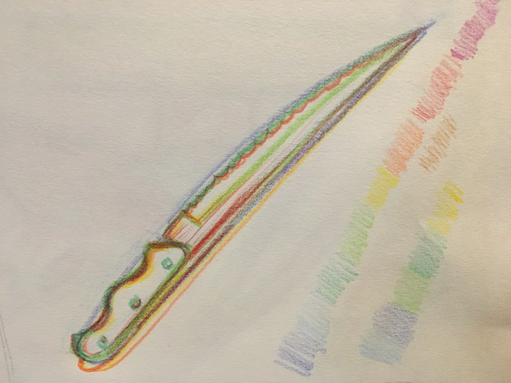
After doing a few small tests with colored pencil, I decided it would be prudent to do the larger drawing with something a little less fine. Here’s a test drawing i did of the same composition using crayons:
While the crayons were a bit harder to control and generate fine detail with, I liked the way they flowed through long strokes and how they were able to create broader lines than the colored pencils, so I chose to use them for the final piece.
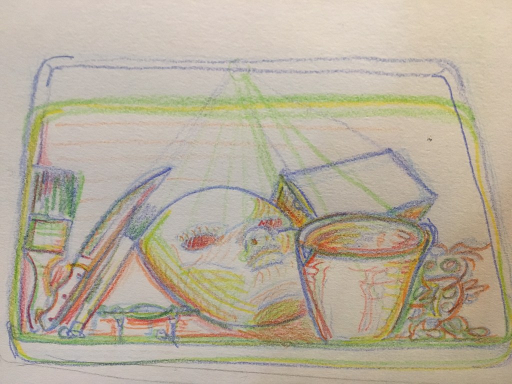
Work in progress 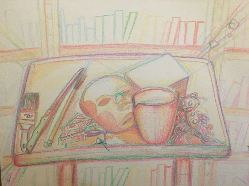
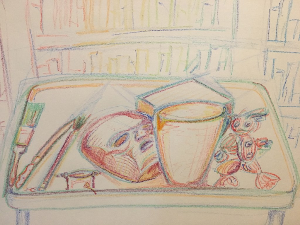
Finished still life
After completing all the crayon layers in the main still life, I added a simple background and some sparkles (I thought they fit with the aesthetic, leave me alone). Some of the very small details were finalized with colored pencil. I then used Photoshop to increase the saturation of the finished picture, creating a truly prismatic visual experience.
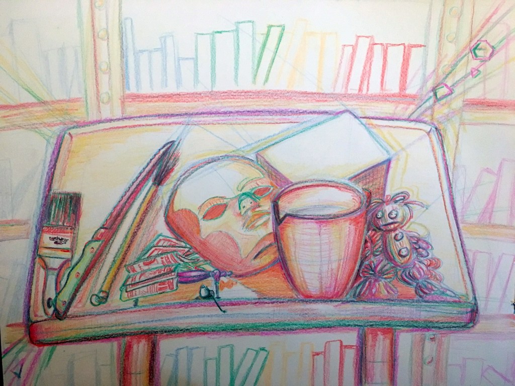
I love how absolutely drenched in color it looks. Honestly, I was a bit skeptical about this method of cold-to-warm layering, but I’m quite please with the end result and will definitely be using it again in the future!
Looking back at the finished version, I can see some similarities to the work of Janet Fish beginning to form, although my still life is significantly less developed. Ms. Fish’s use of color in her still lifes (still lives?) fills me with the same unbridled chromatic joy I can begin to see emerging in this piece. The use of color is very clever is Ms. Fish’s paintings and it makes them a real treat to look at, with many vivid, saturated hues dragging your eyes from one lavishly rendered object to the next. She also uses color to indicate light and transparency to beautiful effect. Of course, these are fully developed paintings, whereas my comparatively simple piece is but a mere contour study, with color used as a history tracker rather than a way to represent the real-world appearance of objects. Nevertheless, I think there are definitely some similarities in vibrancy and atmosphere.


What I’m Listening To:
What I’m Listening To is what I’m listening to when I make art.
