This is the first one, guys.
So, yeah, that’s pretty much it.
— Albert Einstein (probably).
This is the first post on the blog.
There’s not really anything here.
It’s just the first one.
3/31/2020 Edit: Just realized something.
It’s the second post.
So, yeah, that’s pretty much it.
— Albert Einstein (probably).
This is the first post on the blog.
There’s not really anything here.
It’s just the first one.
3/31/2020 Edit: Just realized something.
It’s the second post.
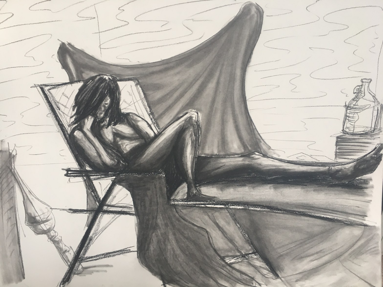
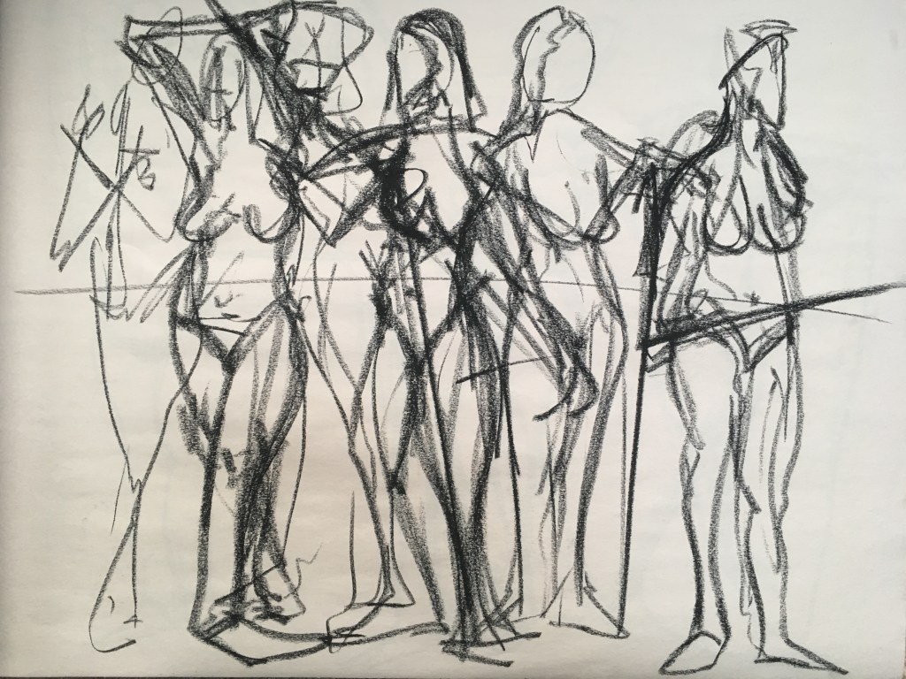
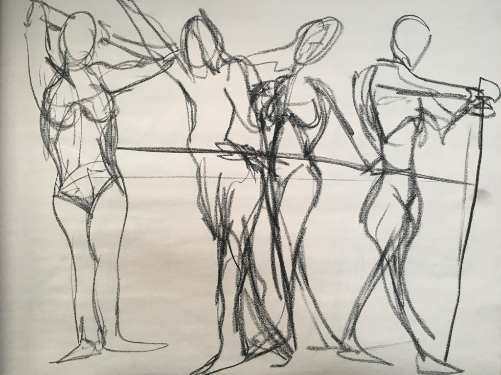
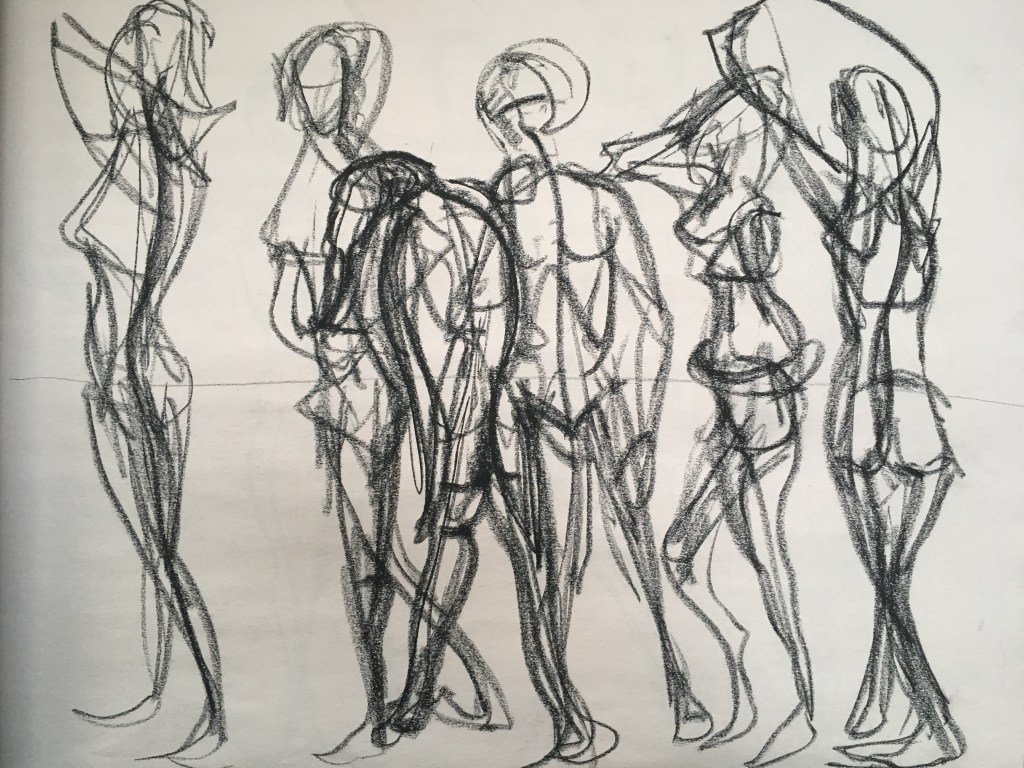
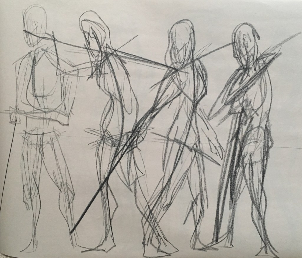
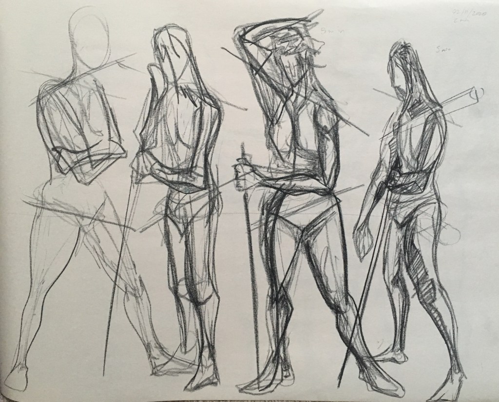
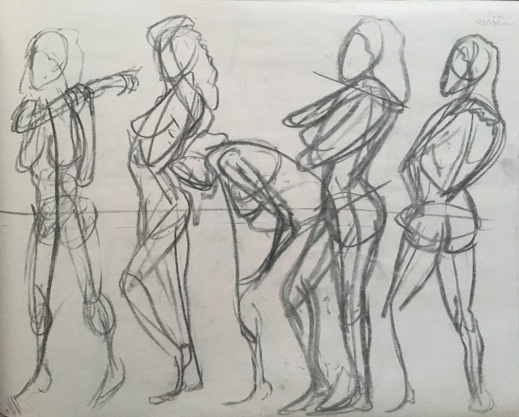
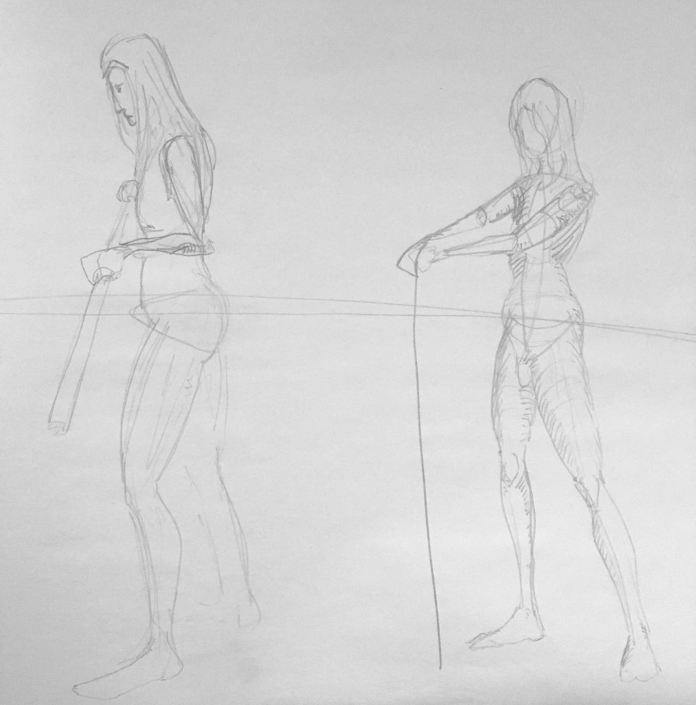
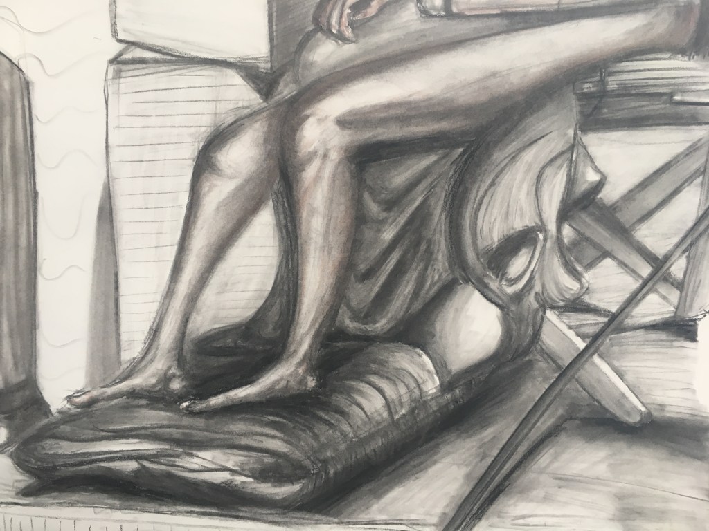
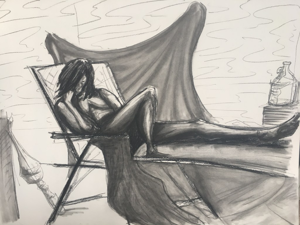
Some stuff from earlier in the year. These exercises were focused on live figure drawing and gesture and were created very quickly. Usually we were only given 15-30 seconds to draw an entire figure. A few of these are as long as 1 minute, but few are beyond that.
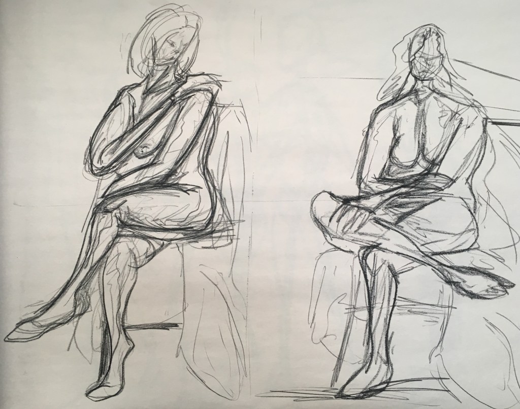
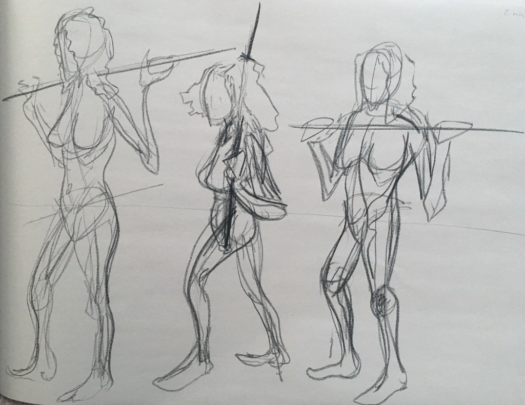
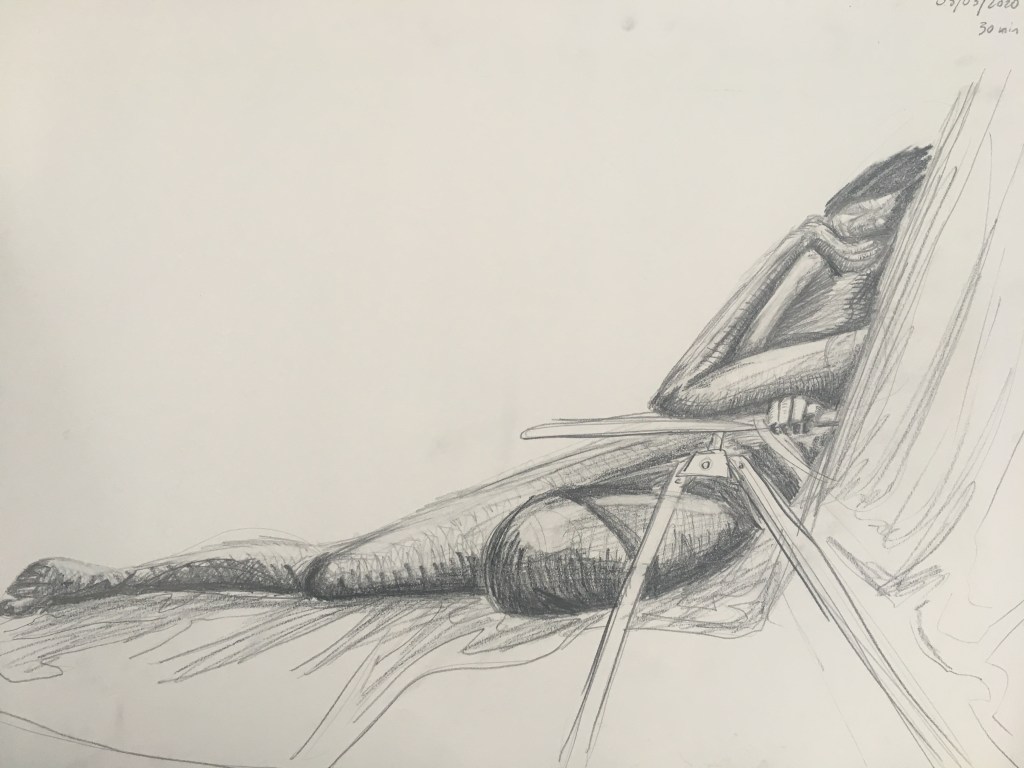
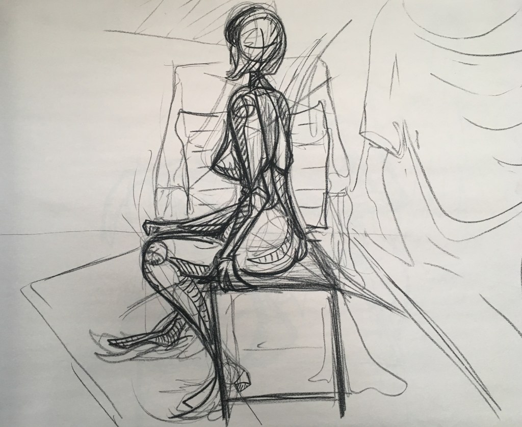
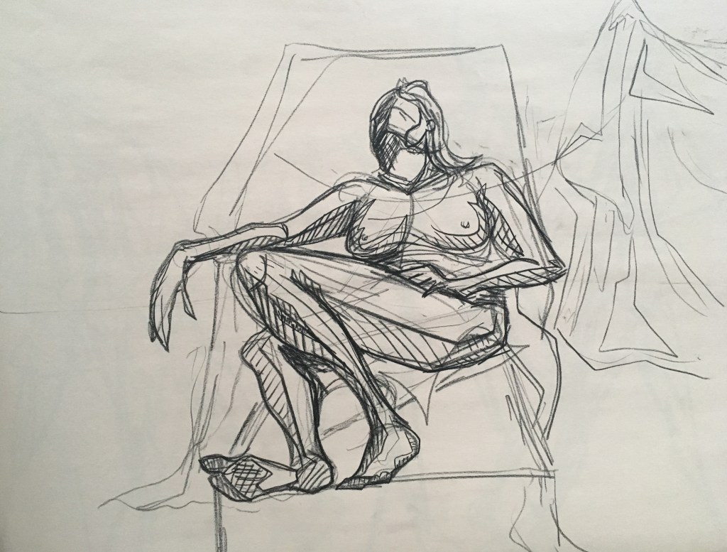
Some drawings with longer allowed time. These are significantly more finished.
What I’m Listening To:
What I’m Listening To is what I’m listening to when I make artwork.

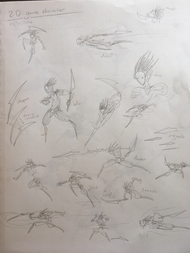
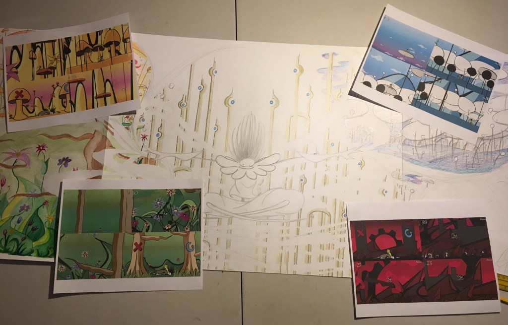
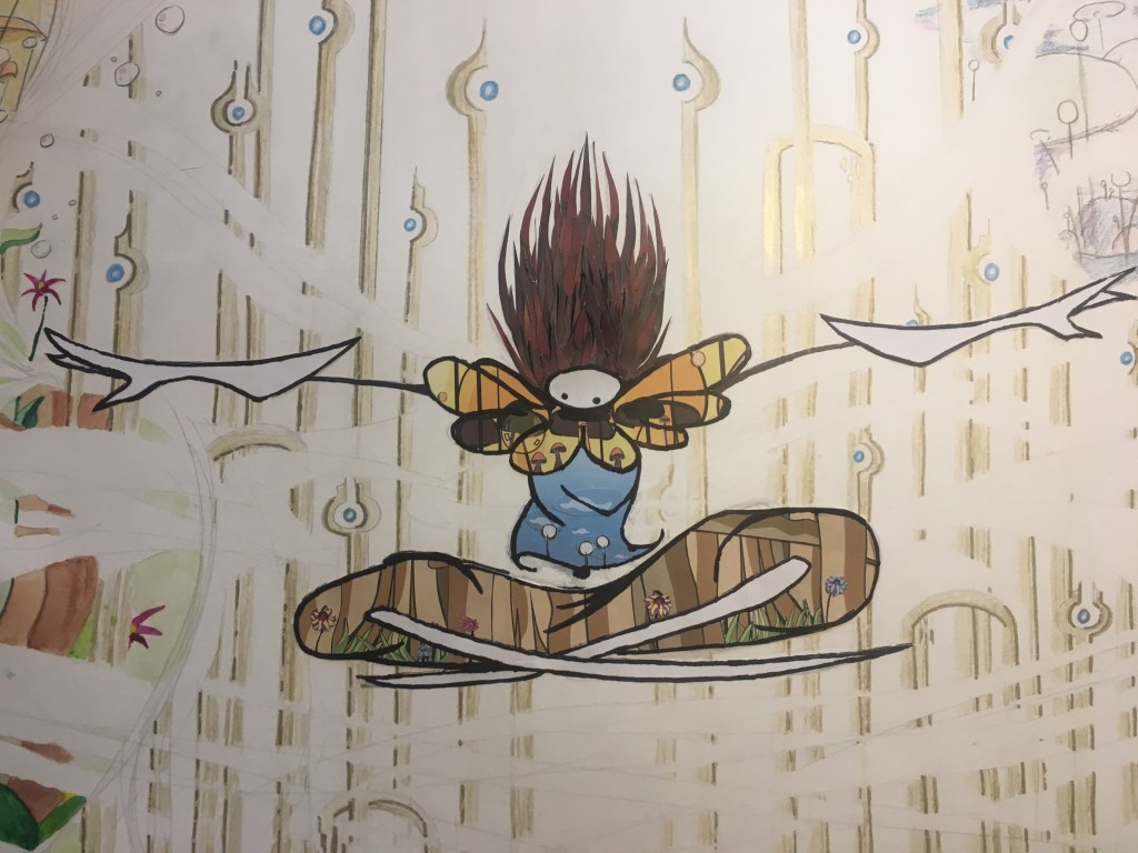
The Final Project for Drawing II involved using multiple media types in combination to create a cohesive Mixed Media piece. Finally, a chance to use everything in my art box!
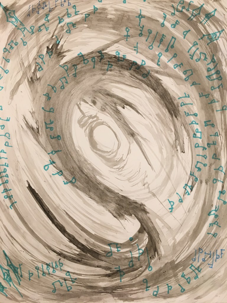
My initial concept was a tower surrounded by an inkstorm with various worlds and dimensions suspended within the maelstrom.
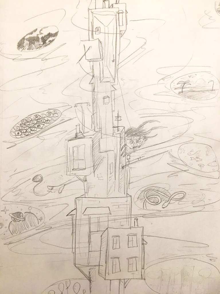
However, I ended up pursuing a variation on this idea with a more specific theme:
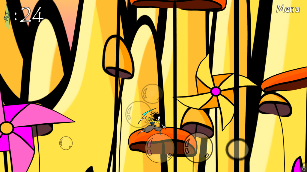
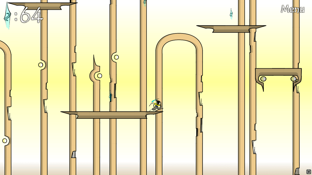
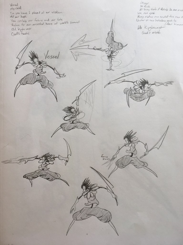
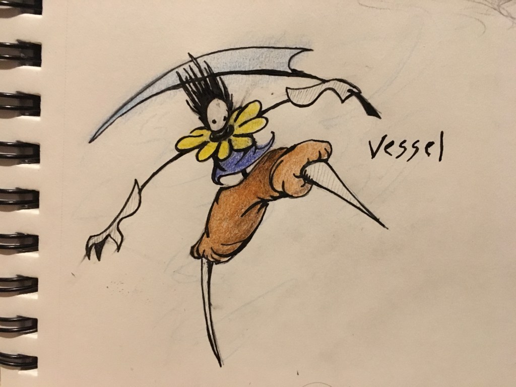
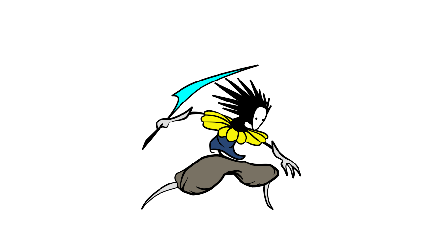
Windsong
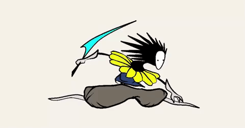
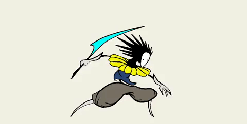
Windsong was a 2D side-scrolling platform game I had created earlier in the semester:
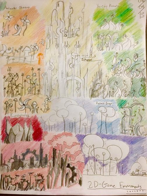
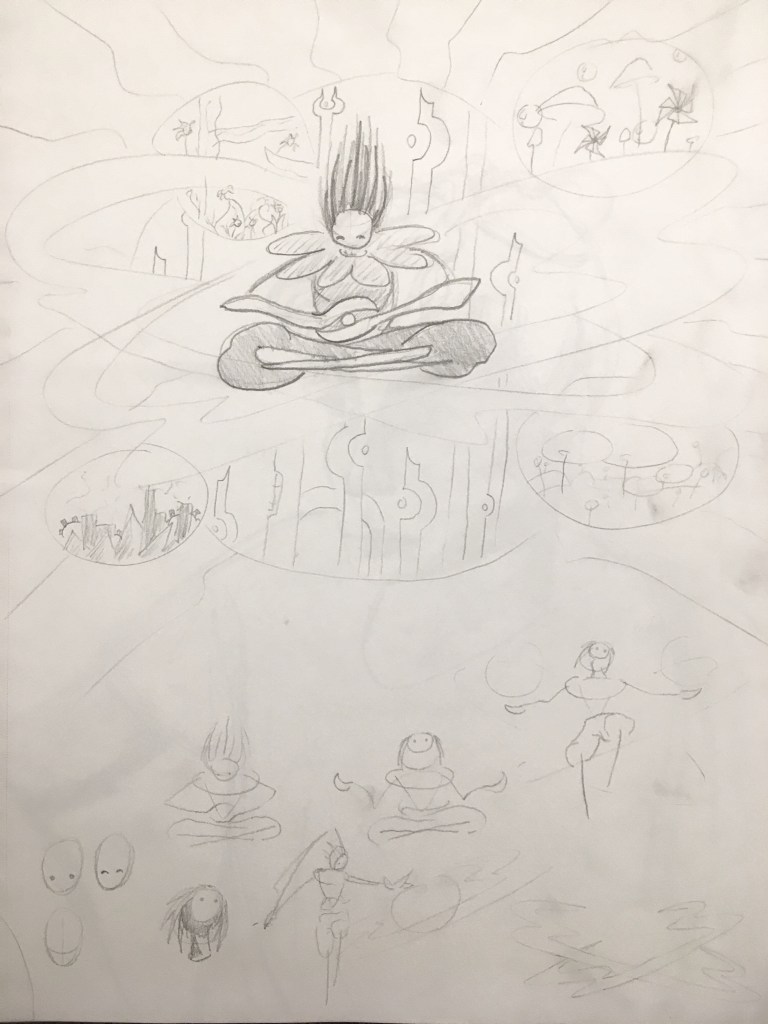
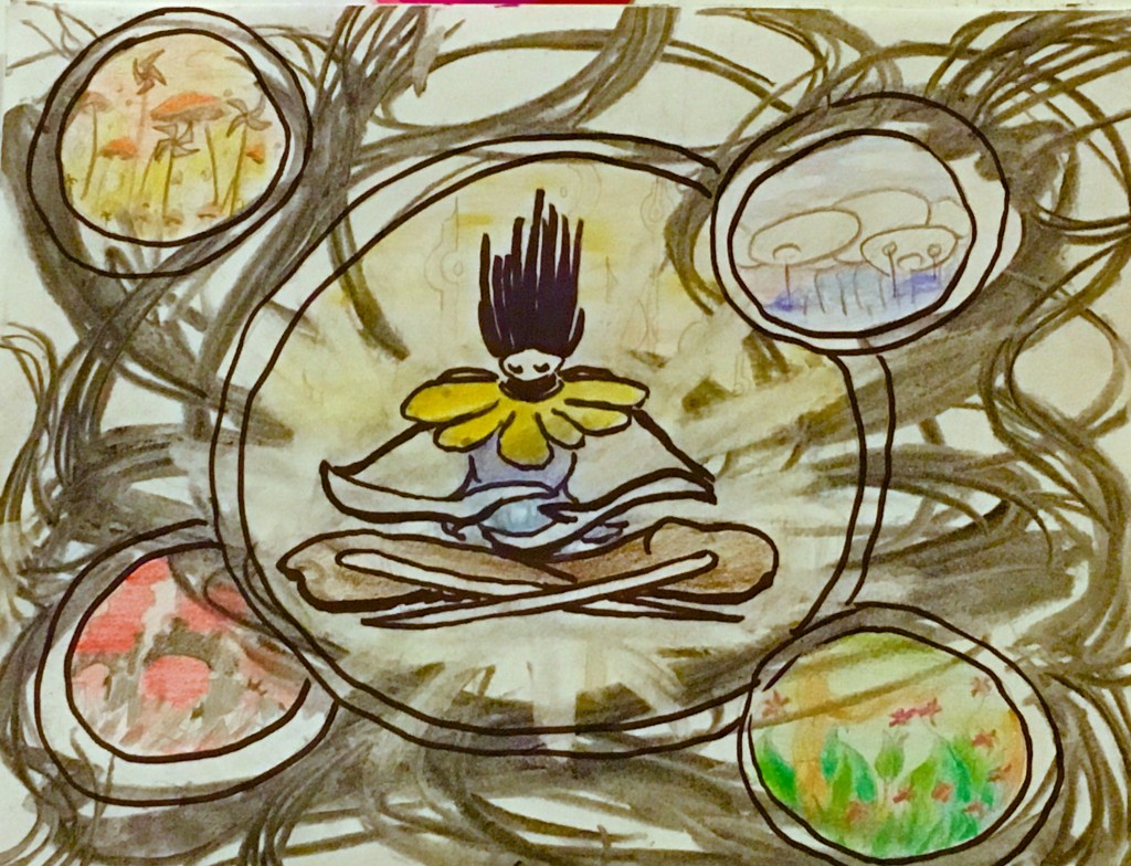
The updated Mixed Media concept involved Vessel (the main character from the game) replacing the tower at the center of the picture and the worlds suspended in the vortex representing the five different environments from Windsong.
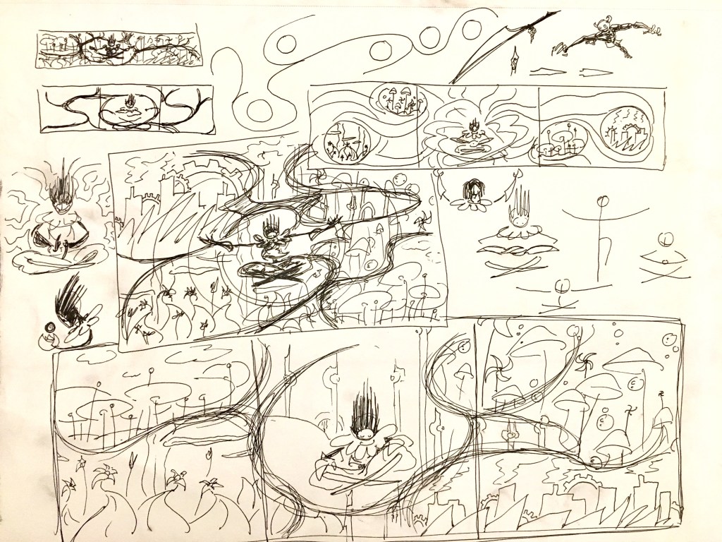
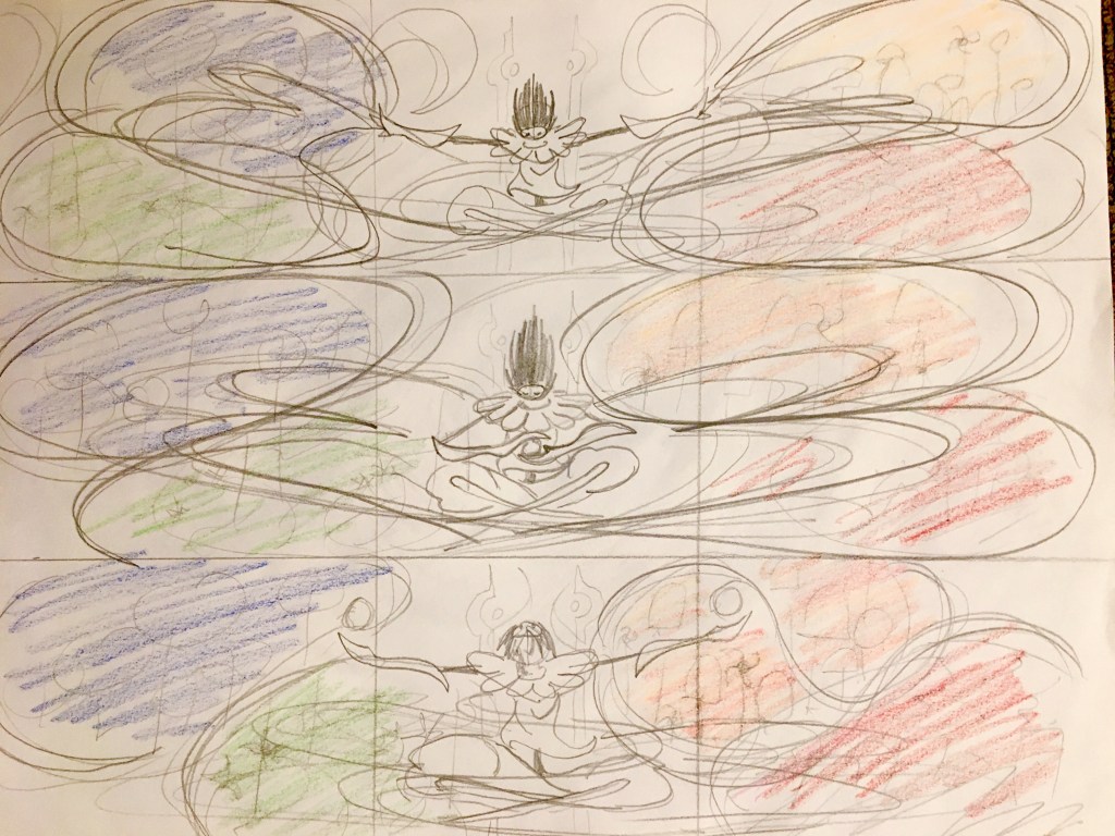
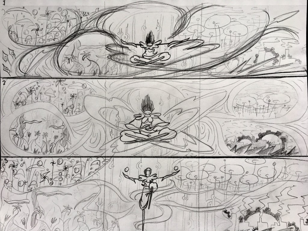
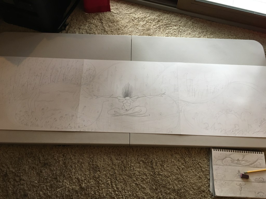
Early on, I realized I wanted to use three 19″x24″ Bristol board sheets instead of one to create this piece. Trying to fit the composition into one sheet felt too squished to me and I liked how the longer format opened it up.
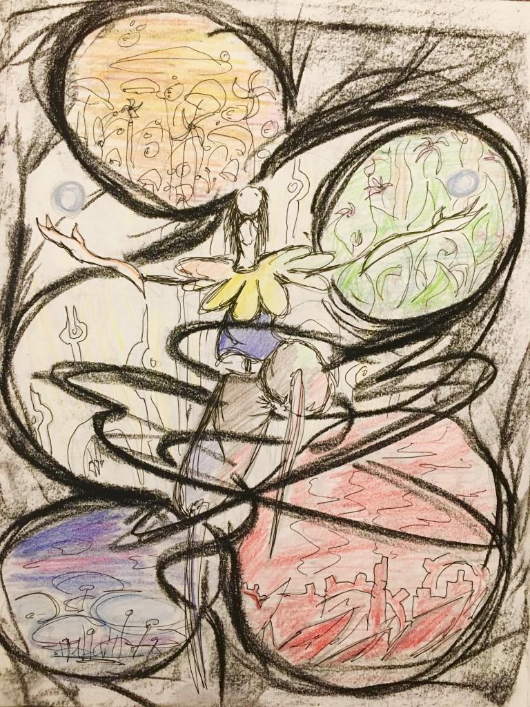
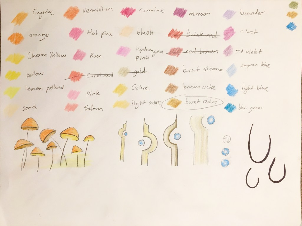
I did lots of material tests to find exactly what media and color palettes to create the worlds with. Watercolor paint for Green, crayon for Blue, colored pencil for Orange and Gold, and charcoal + sanguine for Red.
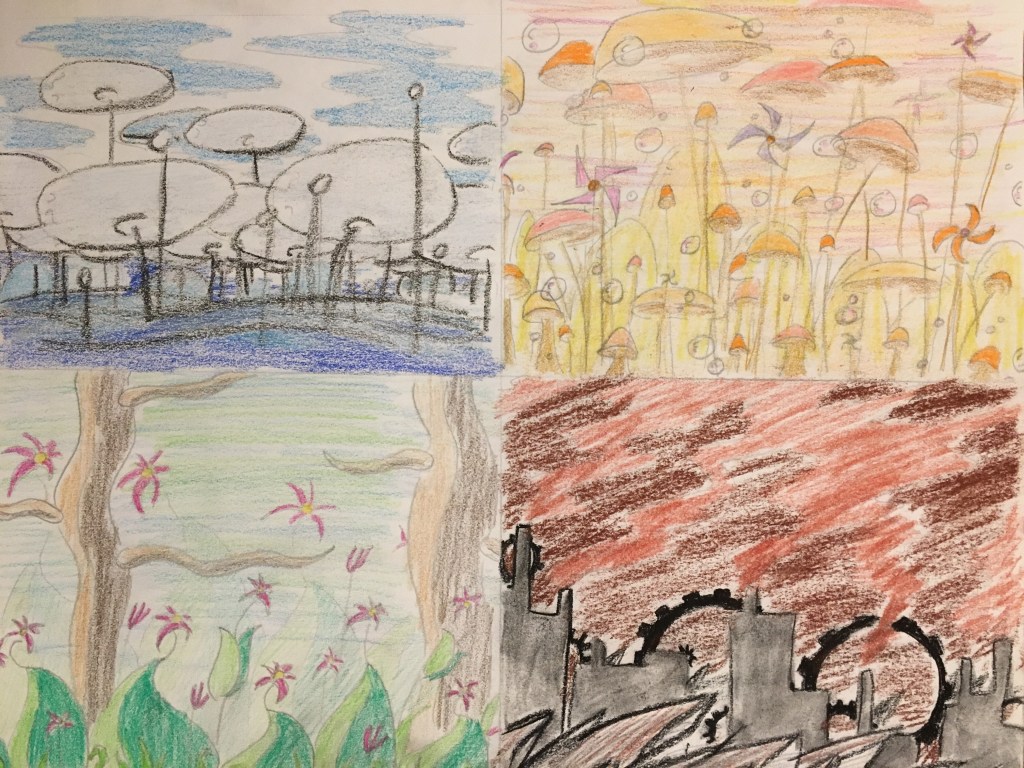
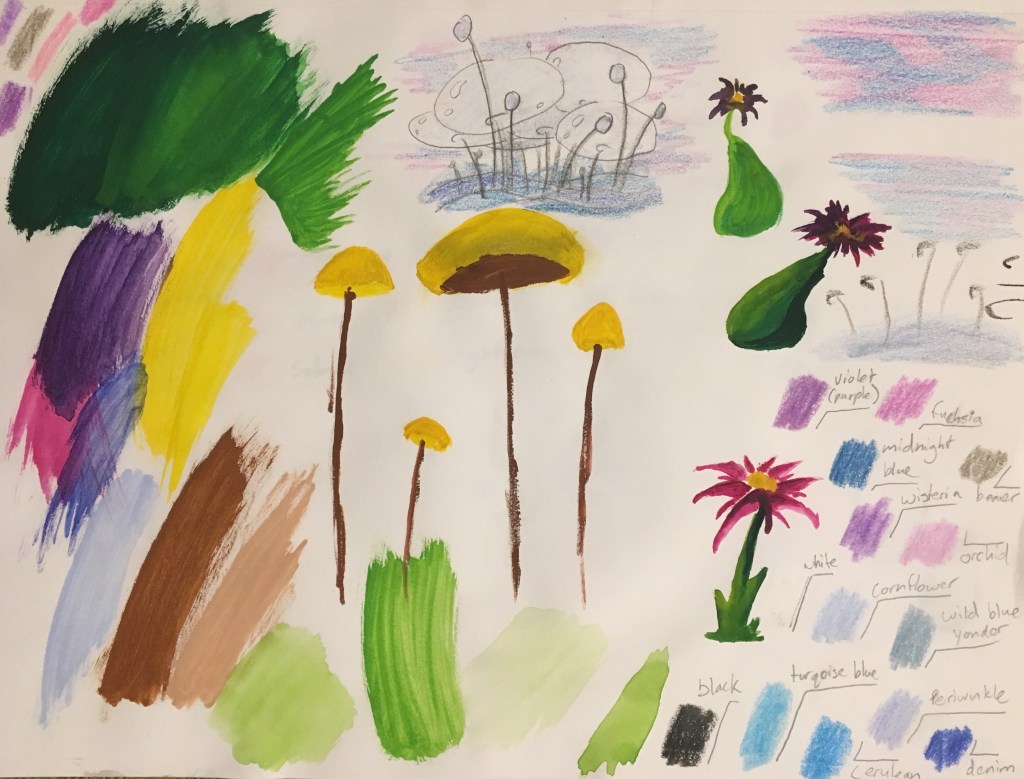
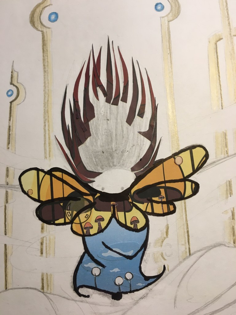
First, I painted Green World (the visuals of which were inspired by Dan Bodan’s music track “Yu City Kamata“, which was also Green World’s background music in-game). This was my first time using watercolor paints (and one of the first times I’ve painted on paper in a very long time), so I’m reasonably happy with how it came out.

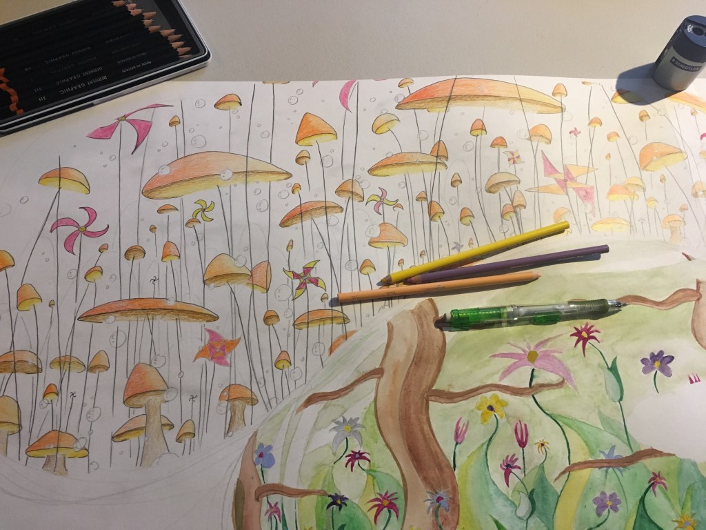
Next: Orange World (Dan Bodan’s “Animaux Obscenes” was the inspiration for this one) using colored pencils (I also did Gold World (“Échappé”) at this point).
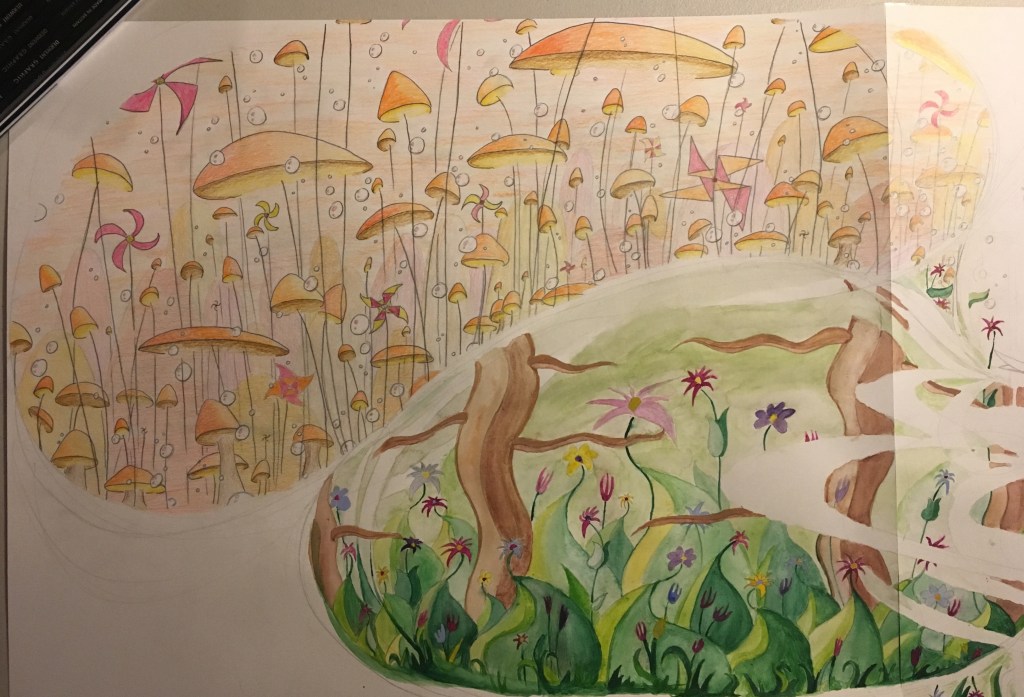
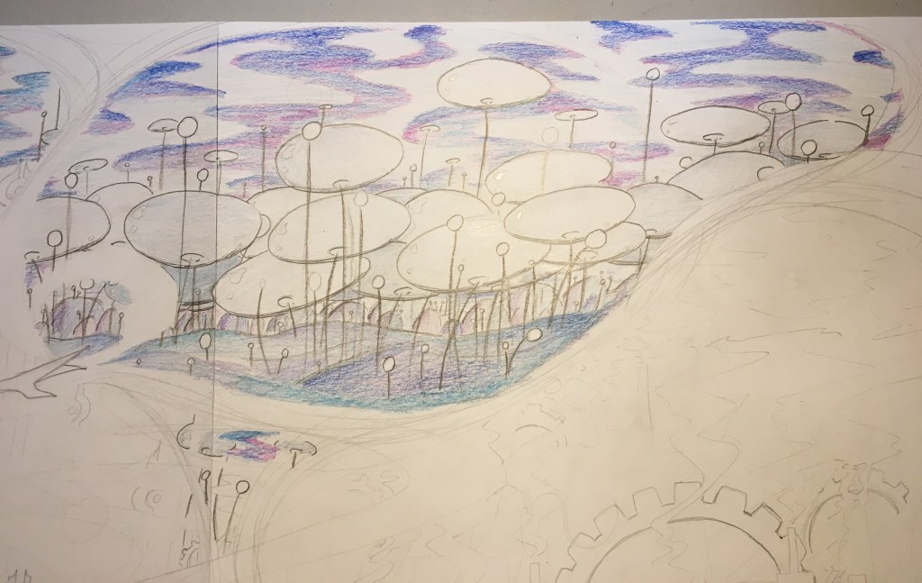
Blue World (“Fortress Europe”) with crayons:
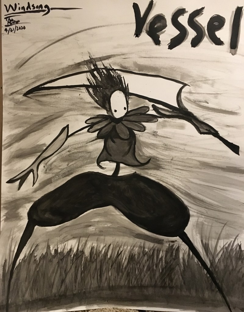
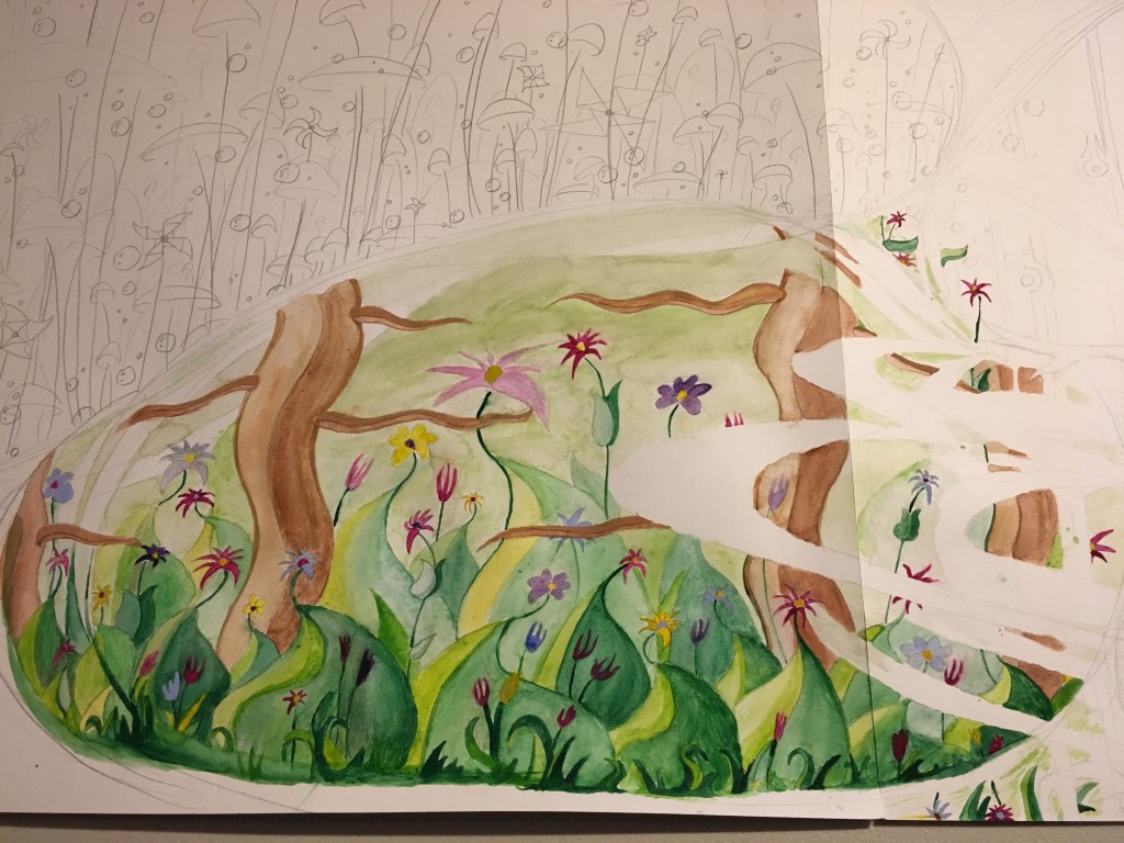
Then, before I could do Red World, I had to put in the central figure. I made Vessel using screenshots from the game in a collage. The spiky rocks of Red World became the hair, the whimsical mushroom forest of Orange World made up Vessel’s yellow collar, Blue World was a natural fit for his blue shirt, and for his baggy pants, I used the trees from Green World. Vessel’s legs, gauntlets, and mask were made from plain white paper to avoid looking too busy. When the whole collage was assembled, I drew the black cartoon outlines back on using a brush tip Sharpie.
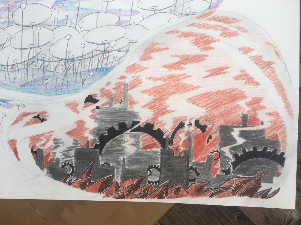
Finally, I put in Red World (visuals inspired by Dan Bodan’s “Kreshchatyk”). Red World had to be done last since it was all charcoal, sanguine, and conté, all easily smudgeable materials. It was also in the lower right hand corner, right where my arm tends to rest when I’m working on a drawing. Bad combination!
With the character and all five worlds finished, I sprayed the entire drawing with a coat of workable fixative to ensure the inking in the next phase wouldn’t damage anything.
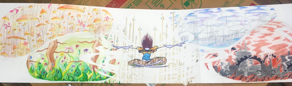
Time for ink! I mostly used custom-built brushes for this.
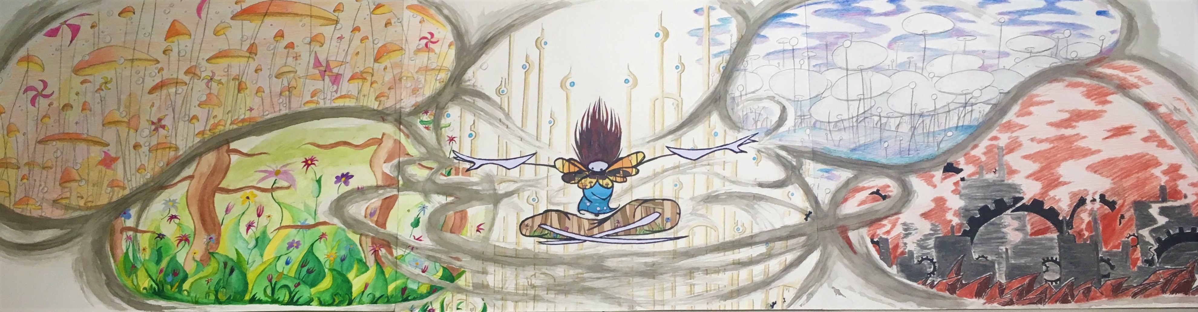

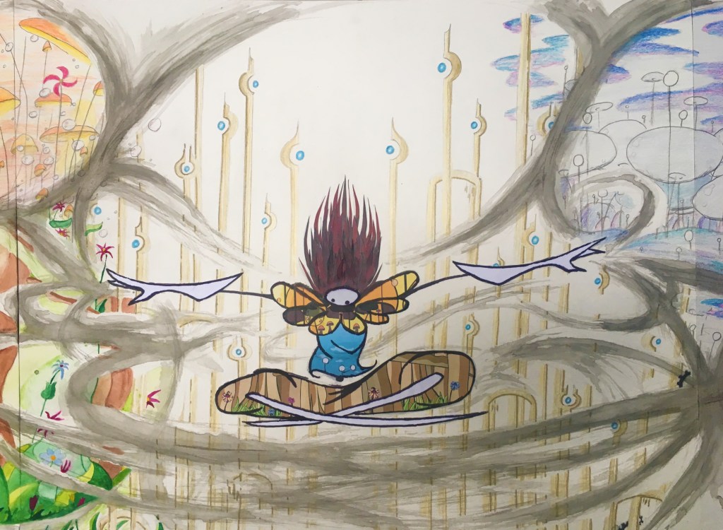

Later on, I felt the drawing was unfinished and made some adjustments to bring it more in line with my original vision. The plain white corners seemed too empty to me and I also felt they detracted from the focus on the center of the image, so I filled them with a grey inkwash to ensure the center was the brightest point in the whole picture. I also greatly darkened the windpaths to create more contrast. Finally, I filled in the grey corners with blue Sharpie music notes and Echo Crystals (collectibles from Windsong).
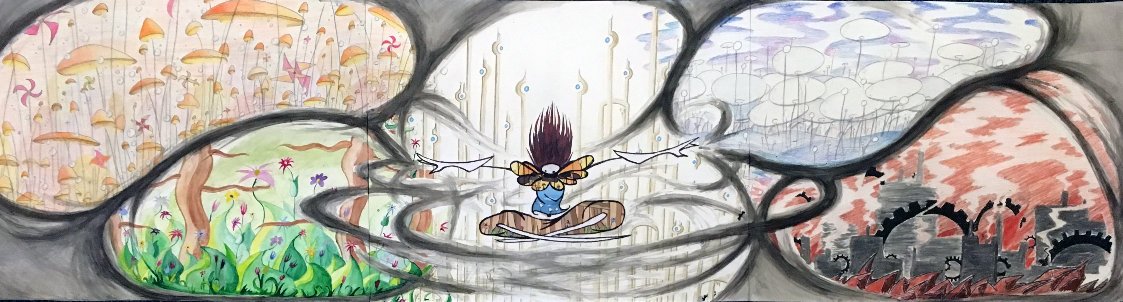
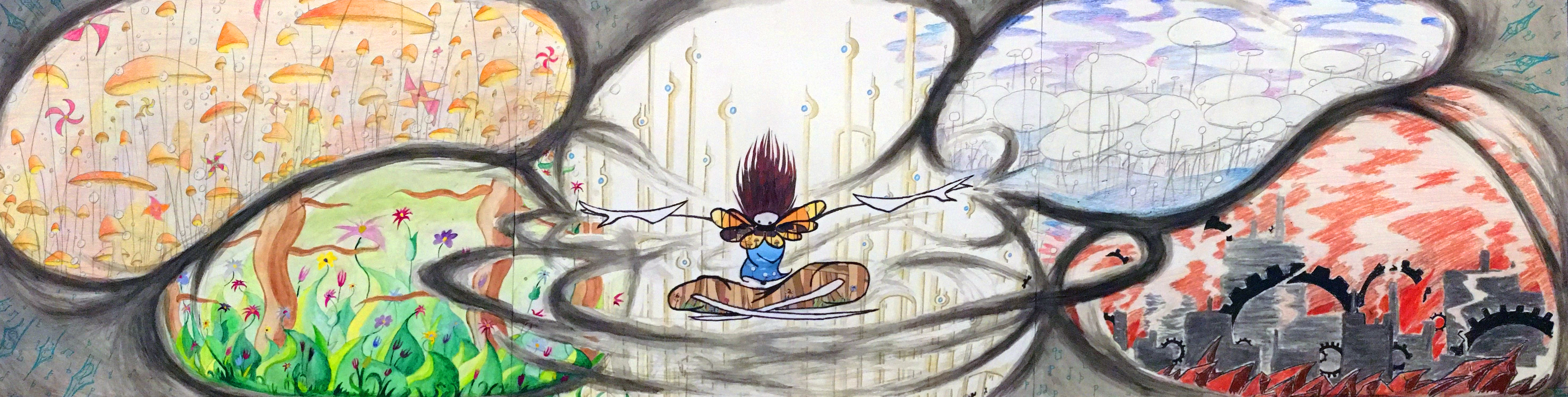
The resulting 6′ behemoth is stunning! The viewer has to physically turn their head to see everything! I’m very happy with this piece; I think the longer composition was the key and following it through really made this design work. I also played a lot with the position of each world based on their color and shape language and I think any other arrangement wouldn’t have looked so correct.
Overall, I think this piece was a great send-off to the semester. It’s huge, it incorporates a lot of techniques, concepts, and tools that were covered in Drawing II, and, most importantly, it represents exactly what I wanted it to. Windsong was a wonderful project to work on and getting to revisit it for this piece was a very rewarding experience.
(If you’re interested in playing Windsong, you can find it here. Simply download the .zip folder, extract it’s contents, and run Windsong.exe.)
What I’m Listening To:
What I’m Listening To is what I’m listening to when I make art.
Or as I’ve started calling it: PSYCHA. Why? No idea. I think I probably made a typo somewhere and it just stuck in my brain.
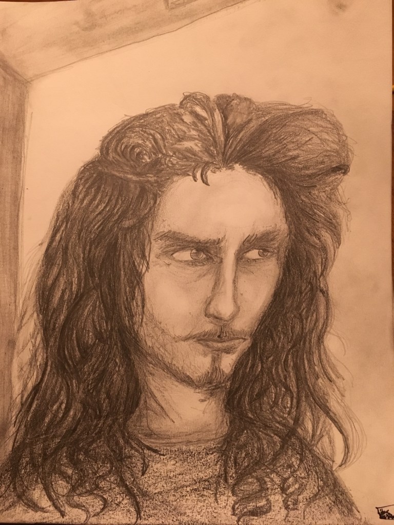
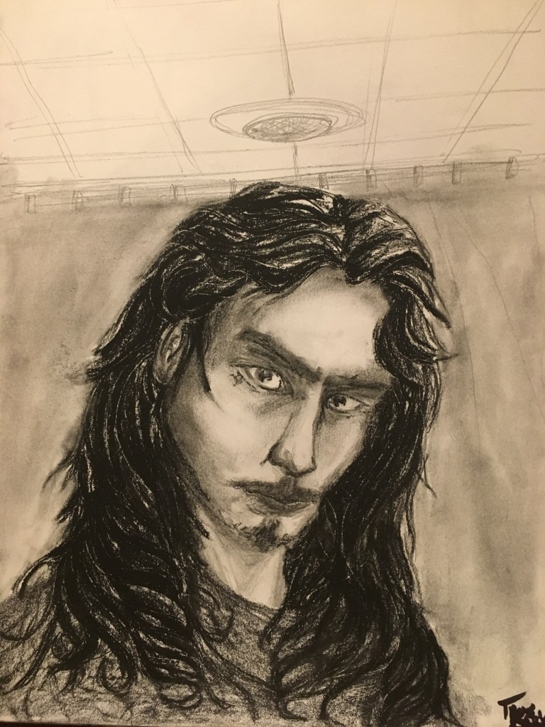
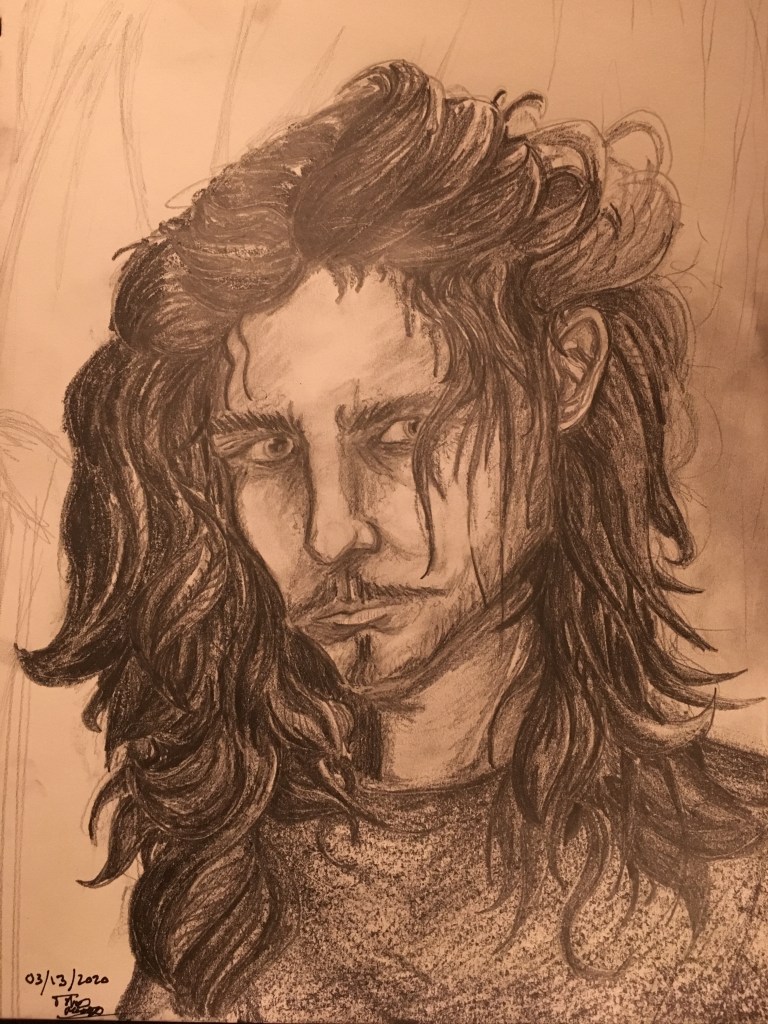
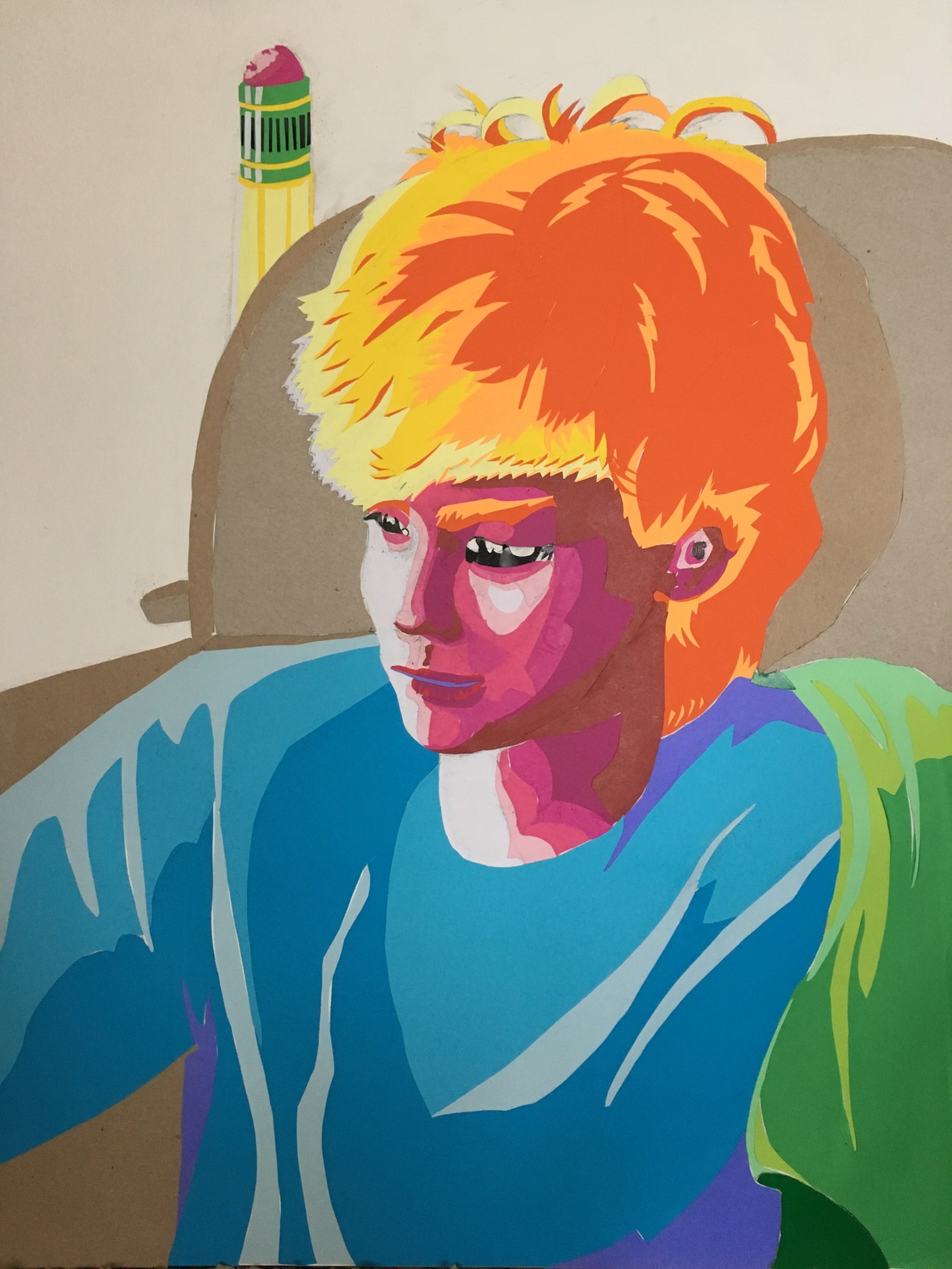
Anyways, I made this PSYCHA portrait of my brother/apprentice, Lance. Since portraits aren’t my specialty, I did lots of sketchbook tests before I committed to anything on my larger paper.
Unfortunately, the first sketch does not portray my brother’s psyche. It portrays my brother’s psyche after consuming eight consecutive lemons.
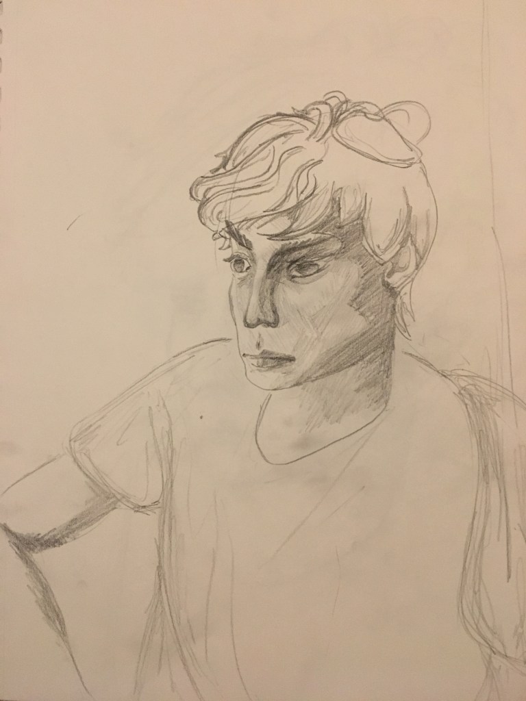
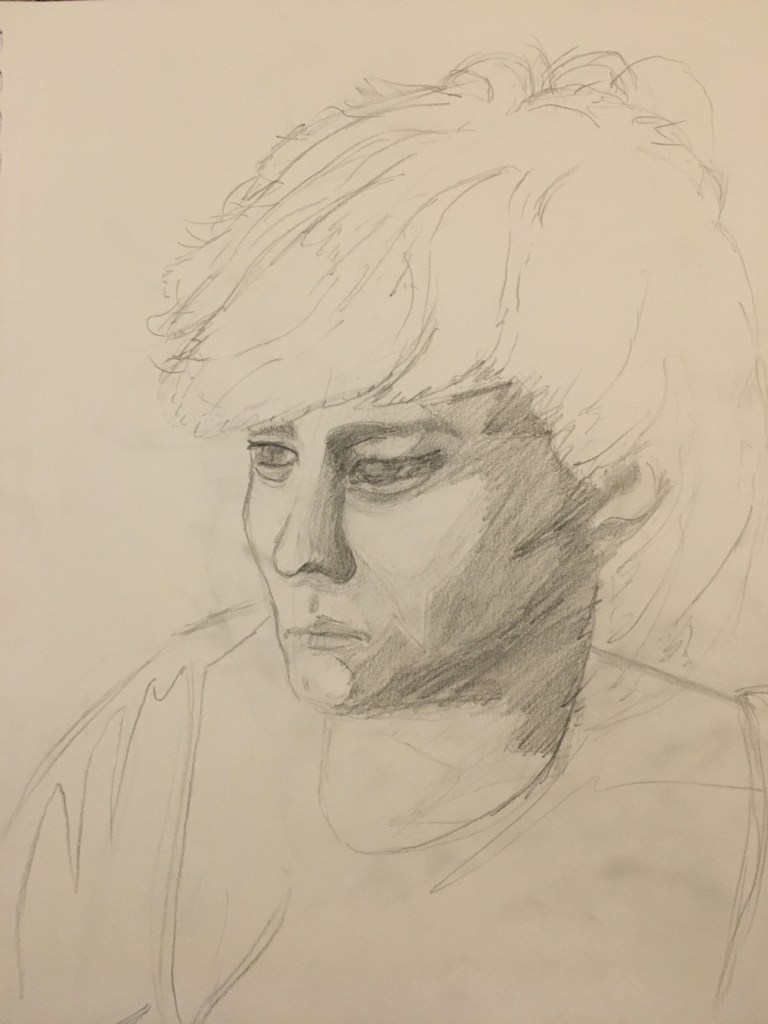
At this point, I realized my hasty shading was letting me down, so I instead focused on breaking down the face into a handful of core values.
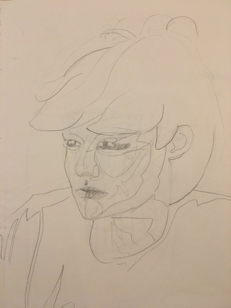
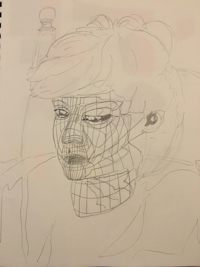
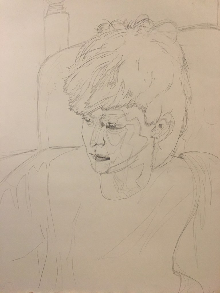
Using the purely contour test as a reference, I finally did a sketch on the big paper (18×24″).
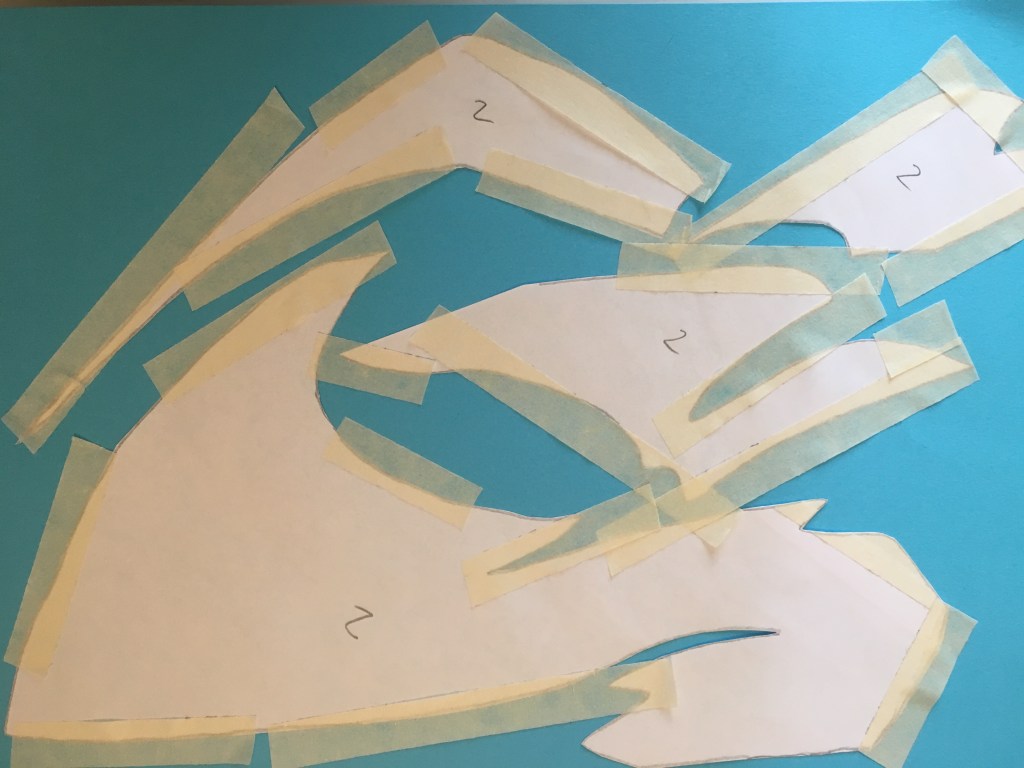
Next step: collage time. This is where the real pain begins.
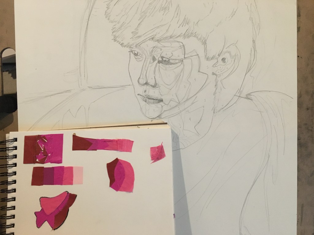
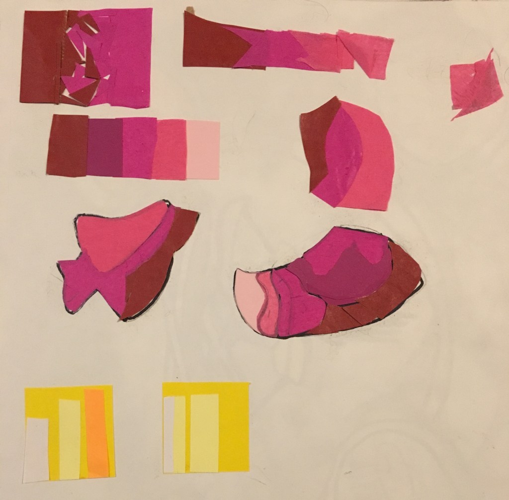
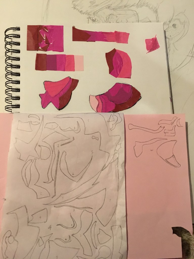
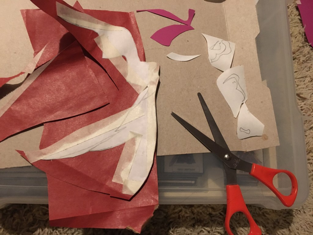
Here’s the fruit of all that labor: one freshly concocted magenta face and a whole lotta tiny paper scraps.
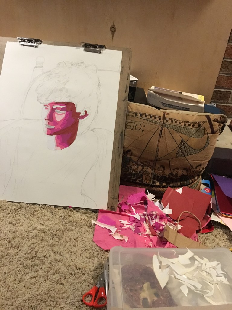
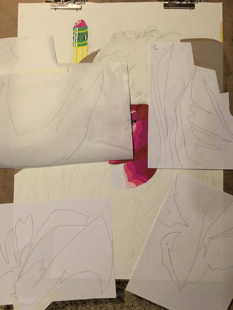
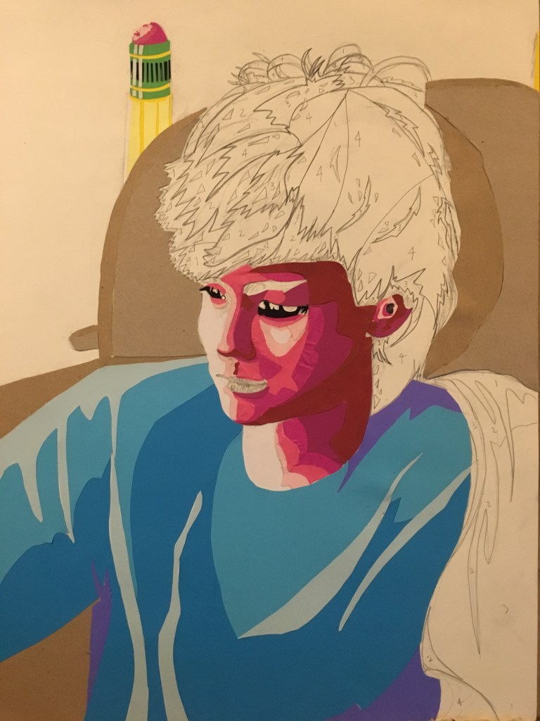
Next up: the hair. The hair was super tricky and went through a few iterations before I got to the final result. Then I added the shoulder drape and lips and that was that!
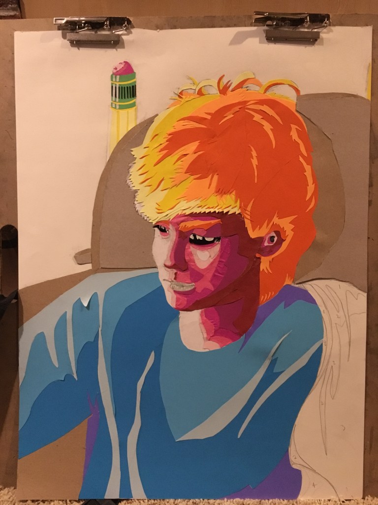
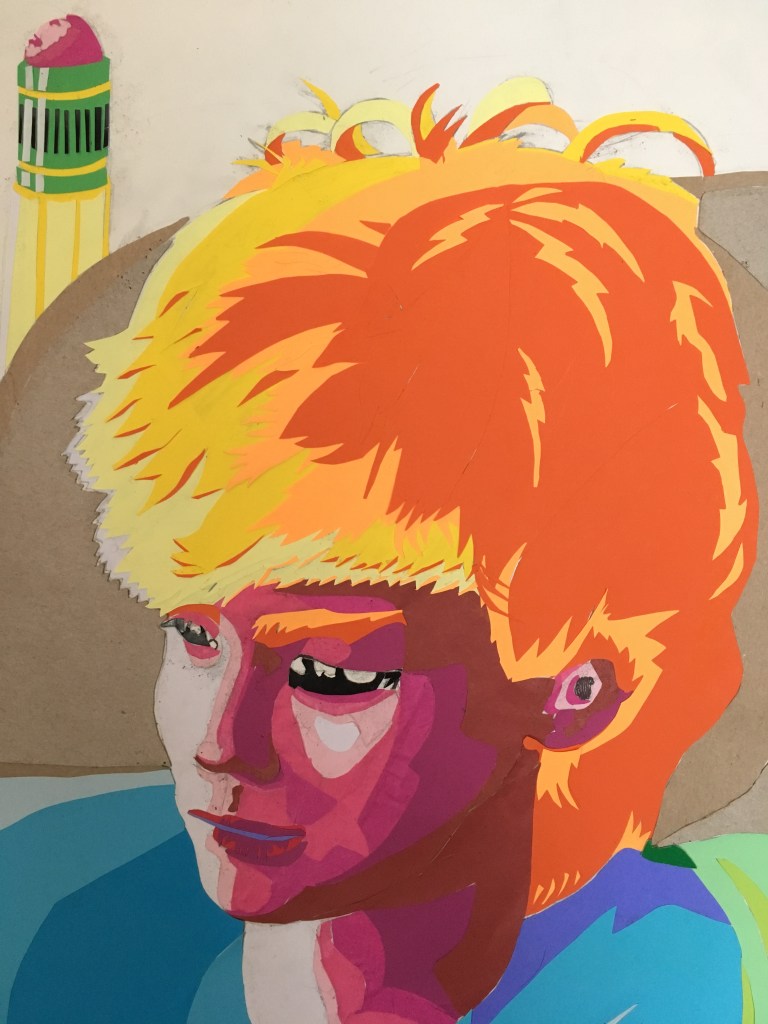
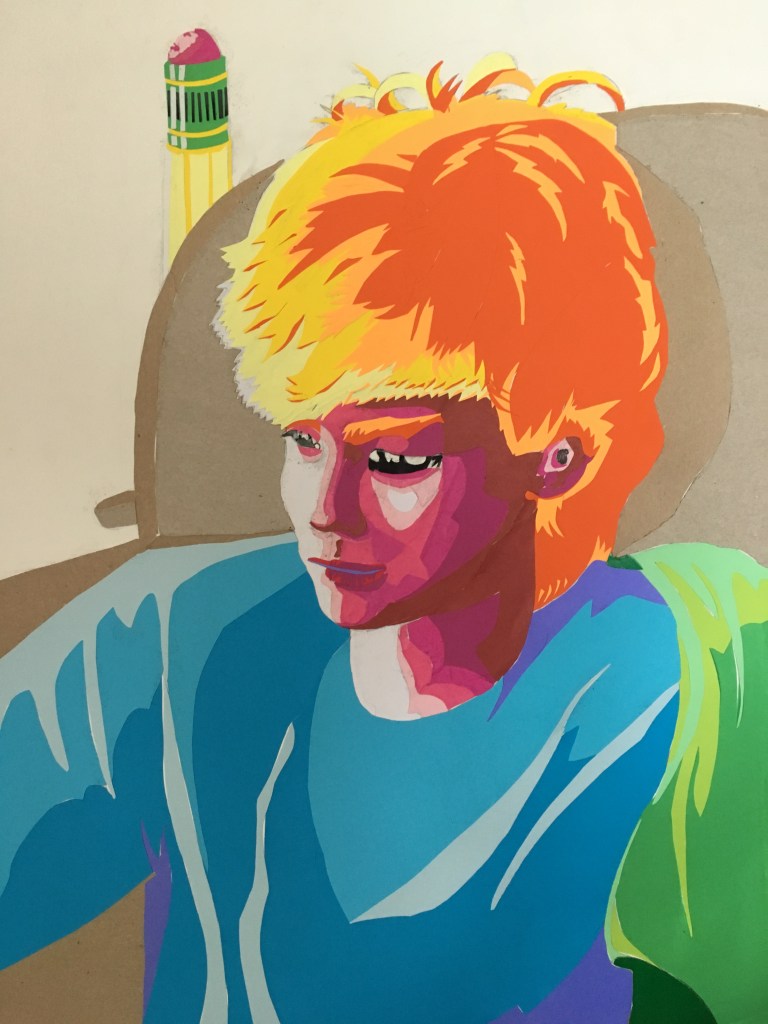
I’m really happy with the way it turned out. The key to achieving success with this style was definitely focusing early on breaking down shapes into core values. I limited myself to no more than five values on any given object (you can see some of my number notes on the sketch and stencils in previous pictures). This was partly because of limited materials to make the collage with, but also because it forced this “toony” style, which fits Lance very well. I also kept almost all the warm colors in the image focused on the head (which is also where the most detailed areas are) to ensure that the face itself remains the focal point of the artwork.
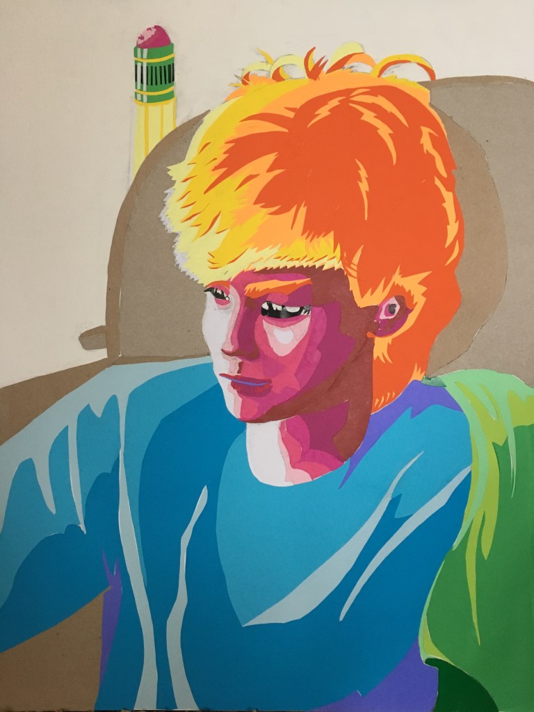
While I was working on this, Lance commented that it looked like something Picasso would do. I disagreed with him because Picasso’s portraits tend to be much, much more abstracted than this one.


While they may share the same lurid color scheme and clean edge lines as my PSYCHA portrait, their emphasis is completely different. Picasso is trying to portray the inner feelings of his subjects by drawing his perception of their emotional state, while my approach was more focused on using an abstract style to mimic the natural expression of the subject as closely as possible. Picasso also tends to work with large blocks of color and focus less on value, which was a huge part of my Lance portrait.
What I’m Listening To:
What I’m Listening To is what music I’m listening to while I make art.

For this project, I initially intended to use ink, so it was the medium for my early sketchbook experiments.
However, I found difficulty in controlling the ink flow and maintaining a consistent value between marks, even after trying several drawing implements, including both traditional brushes and homemade tools.
So next I did some experiments with dry media: graphite, conte, sanguine, and charcoal.
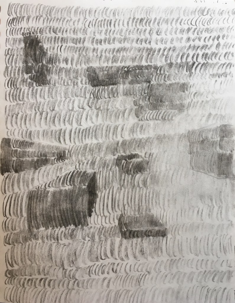
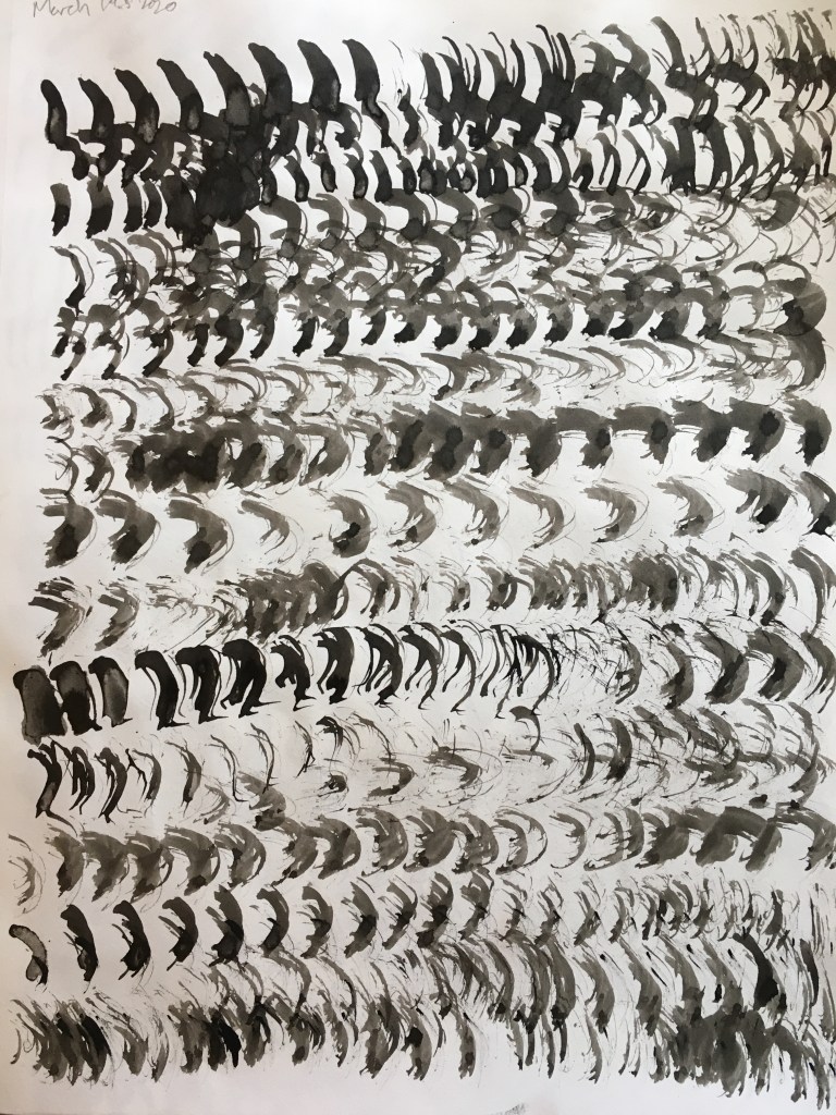
I kept coming back to a repeating figure-eight pattern that was easy to use and produced an interesting “made-of-hair” look. I also chose compressed charcoal sticks for the clear values they produced and the smoothness of their strokes.
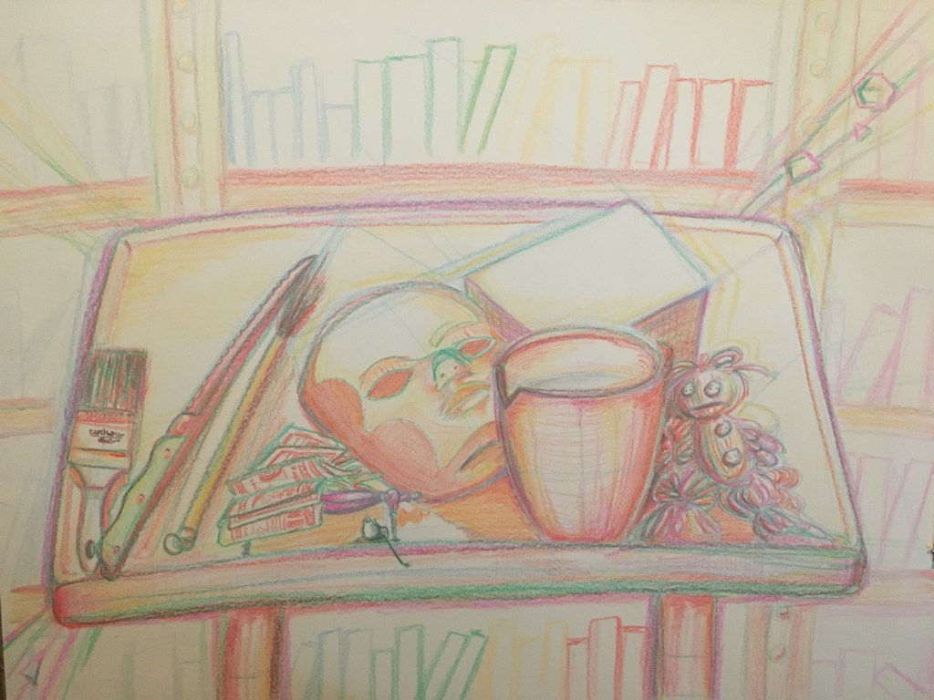
I used these charcoal figure-eights for my final drawing, a still life of Roman vases in a glass case from the Kent State art museum.

This drawing was created by laying out the composition with light gestural lines and then drawing each row of marks onto the page like a printer: top to bottom, left-to-right then right-to-left, varying the value and density of marks in specific areas to create the value changes in the finished piece.
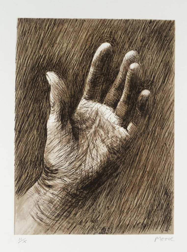
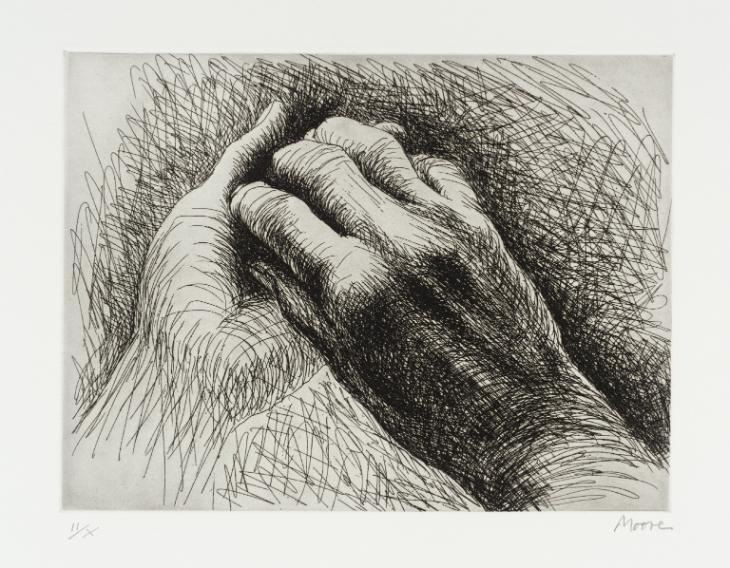
Some other artists that use interesting mark-making techniques are Katy Ann Gilmore and Henry Moore. Henry Moore’s drawings are chaotic and full of energy, using scribble marks going in many different directions to create texture in his compositions. I find his depictions of hands very interesting because of the high level of realism they convey through such wild markings.
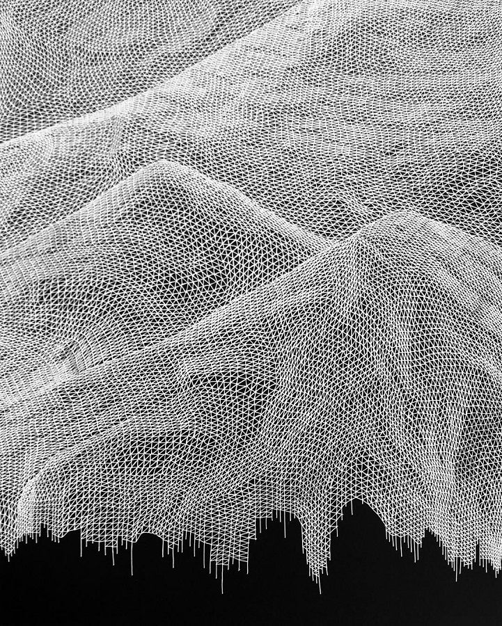
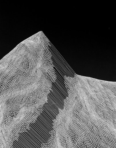
Katy Ann Gilmore has a completely different approach to mark making. Her compositions often resemble topological maps of mountains or other rough terrain. A triangular grid deformed in various ways (compressed, stretched, angled) communicates a sense of shifting mass that gives an illusion of huge, complex volumes. This is a much more precise type of mark making with a basis in mathematics. I always love to see art and math come together and these mountains are no exception.
What I’m Listening To:
What I’m Listening To is what music I listen to while making art.

(& Janet Fish)
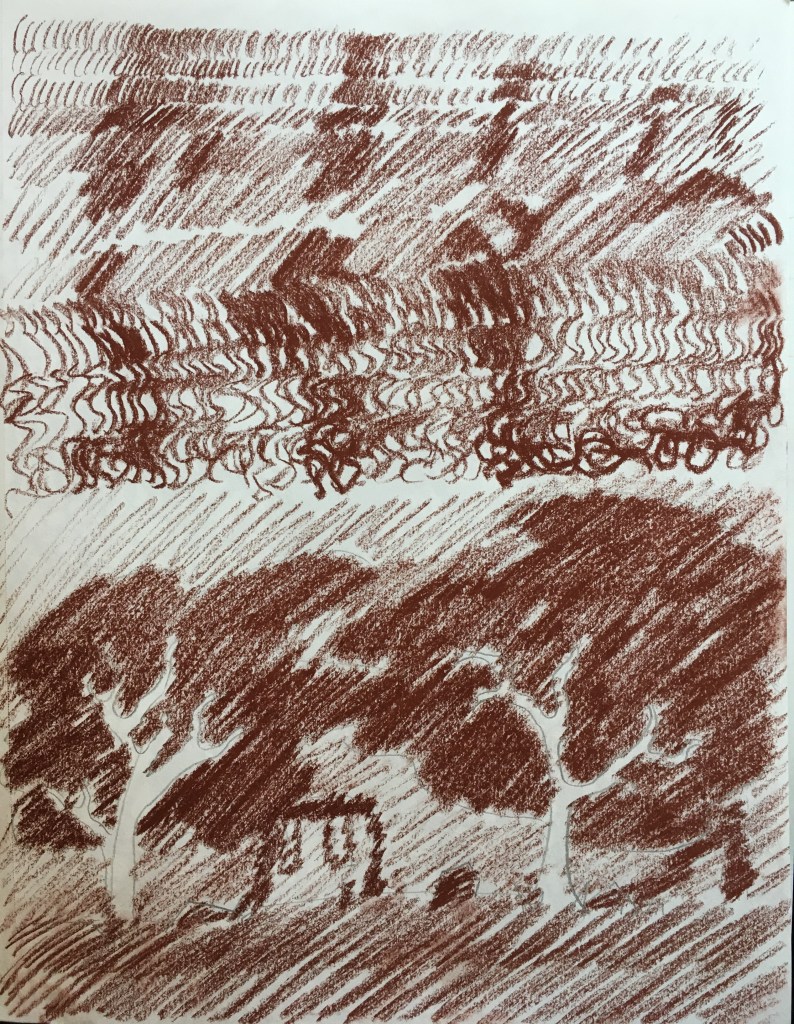
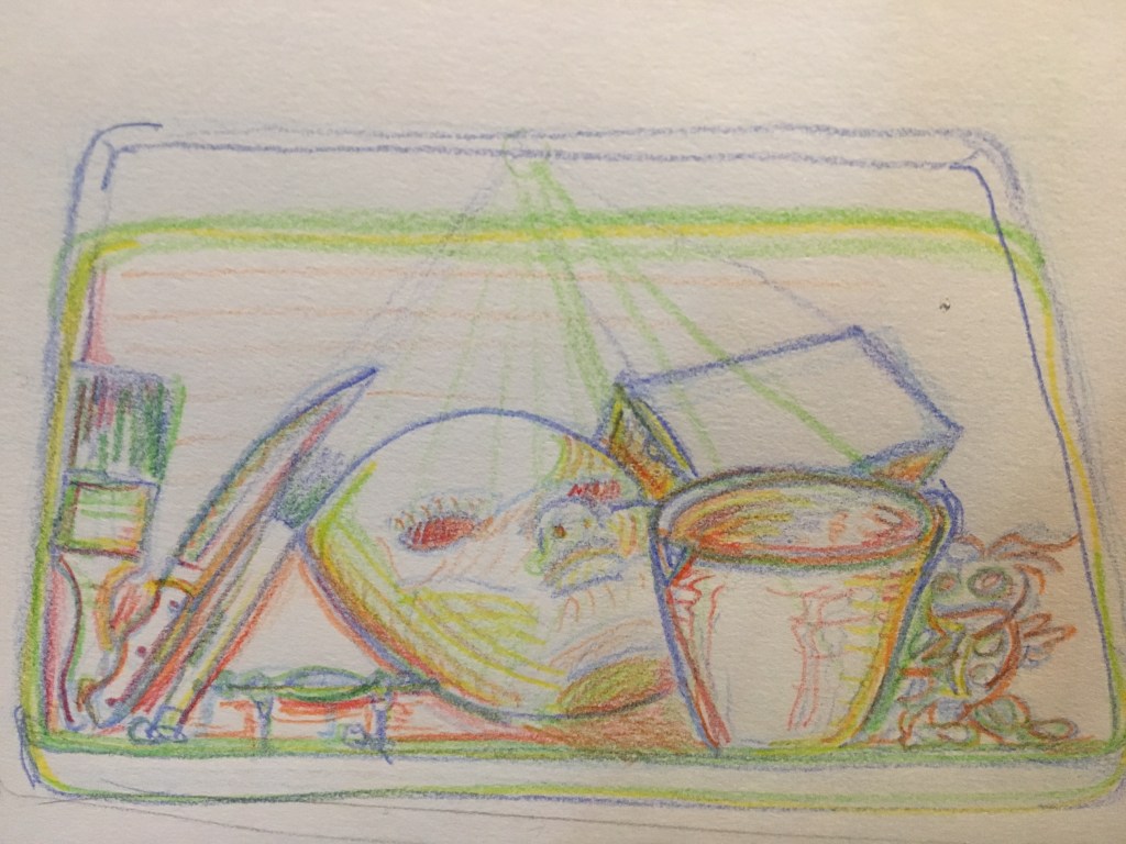
This still life explores a very unique approach to contour study. Color is incorporated into the design of this piece, but not in a traditional sense. Each layer added to the drawing is drawn in an increasingly warm hue, with the gestural start and perspective mapping being cold blues, the initial linework green, the early detail and volume-defining layers yellow and orange, and the finishing touches in red and violet.
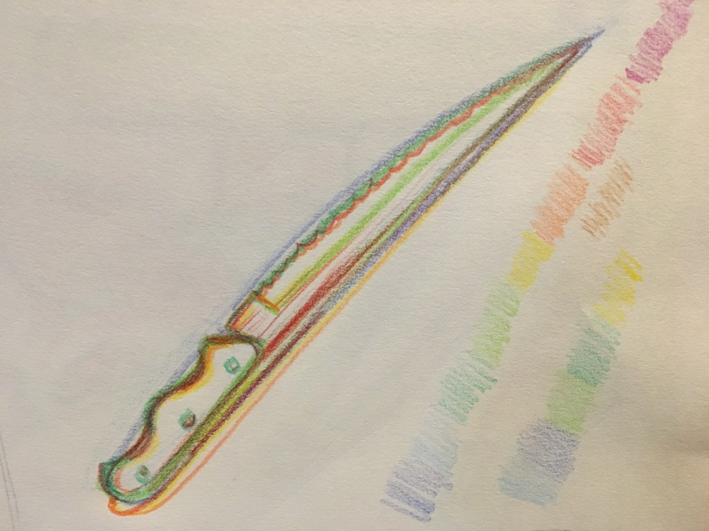
This technique creates a very unusual, chromatically abstract representation of the objects being drawn. The effect reminds me of a prism. Before committing to a larger piece in this style, I did a few sketchbook thumbnail studies of my composition.
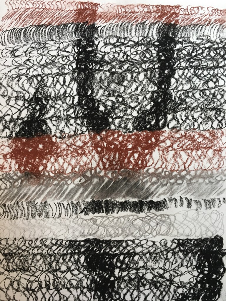
After doing a few small tests with colored pencil, I decided it would be prudent to do the larger drawing with something a little less fine. Here’s a test drawing i did of the same composition using crayons:
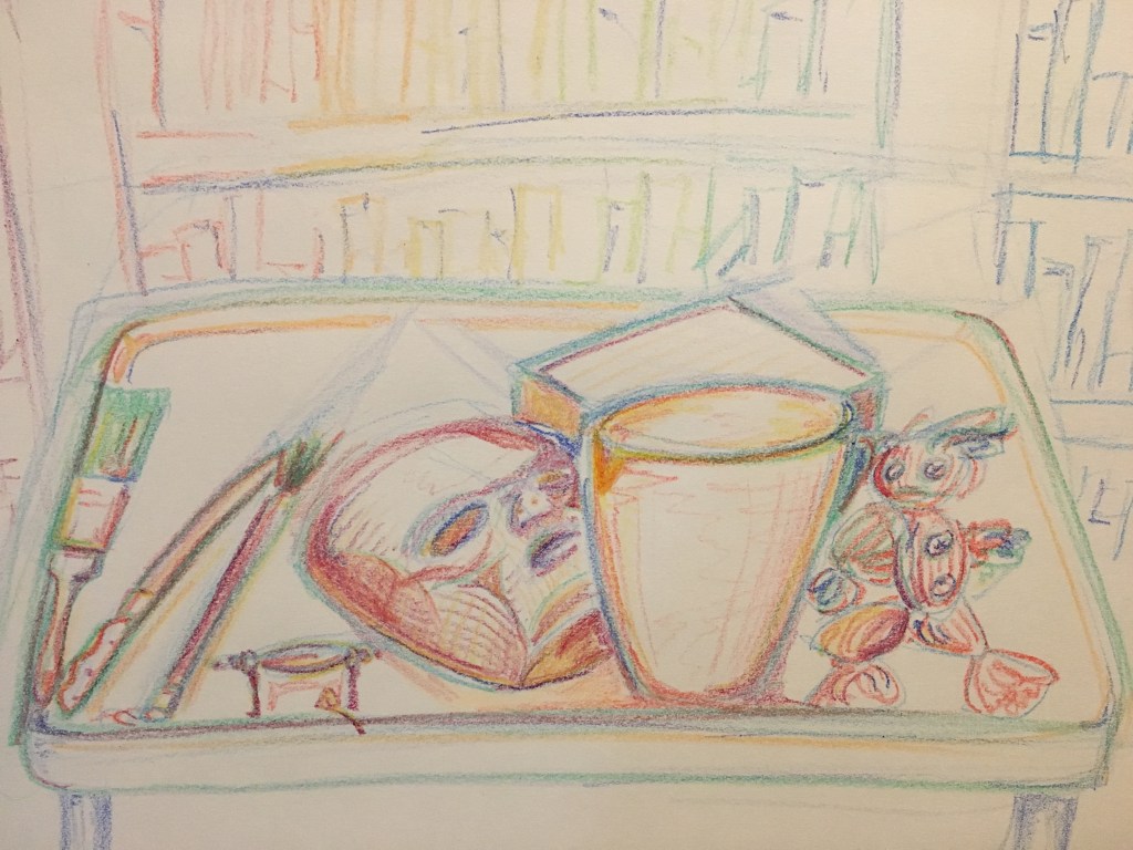
While the crayons were a bit harder to control and generate fine detail with, I liked the way they flowed through long strokes and how they were able to create broader lines than the colored pencils, so I chose to use them for the final piece.
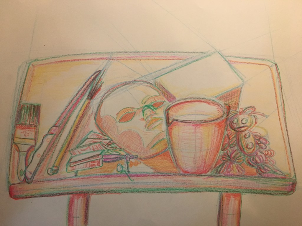
After completing all the crayon layers in the main still life, I added a simple background and some sparkles (I thought they fit with the aesthetic, leave me alone). Some of the very small details were finalized with colored pencil. I then used Photoshop to increase the saturation of the finished picture, creating a truly prismatic visual experience.
I love how absolutely drenched in color it looks. Honestly, I was a bit skeptical about this method of cold-to-warm layering, but I’m quite please with the end result and will definitely be using it again in the future!
Looking back at the finished version, I can see some similarities to the work of Janet Fish beginning to form, although my still life is significantly less developed. Ms. Fish’s use of color in her still lifes (still lives?) fills me with the same unbridled chromatic joy I can begin to see emerging in this piece. The use of color is very clever is Ms. Fish’s paintings and it makes them a real treat to look at, with many vivid, saturated hues dragging your eyes from one lavishly rendered object to the next. She also uses color to indicate light and transparency to beautiful effect. Of course, these are fully developed paintings, whereas my comparatively simple piece is but a mere contour study, with color used as a history tracker rather than a way to represent the real-world appearance of objects. Nevertheless, I think there are definitely some similarities in vibrancy and atmosphere.


What I’m Listening To:
What I’m Listening To is what I’m listening to when I make art.
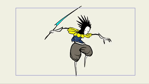
Added a new animations page to the blog. It’s pretty empty at the moment, but I’m working on some epic projects to put in there! Here’s a jump-fall-land sequence I’m building for a character that will be going into a game soon:
What I’m Listening To:
What I’m Listening To is what I’m listening to when I do art.
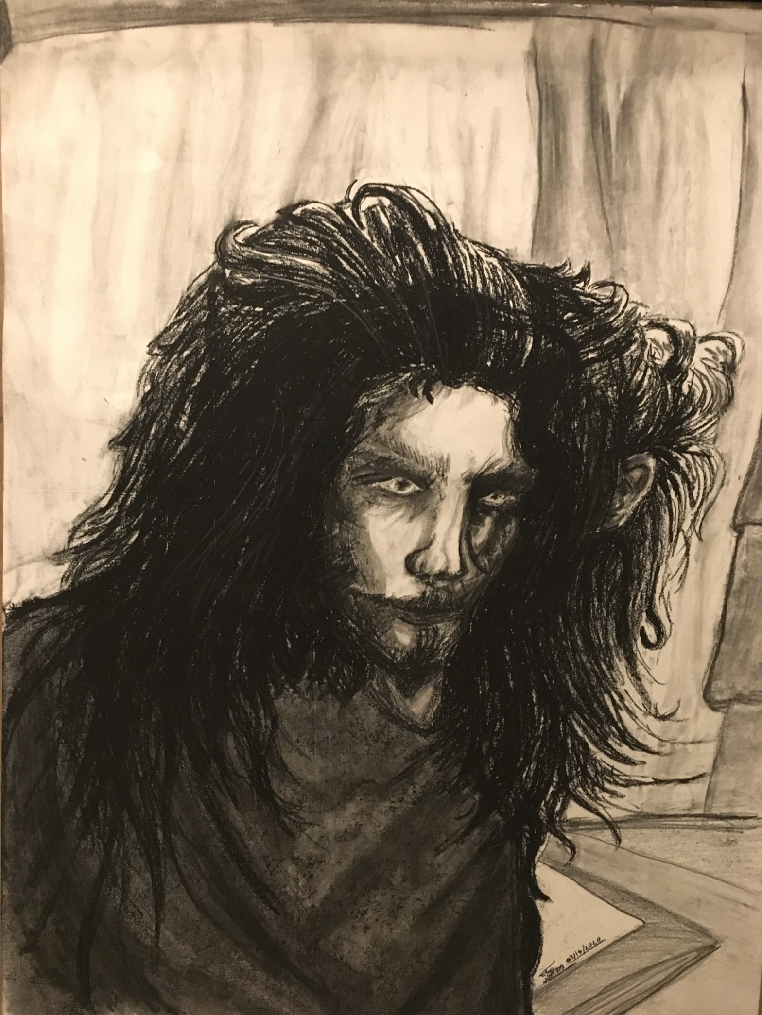
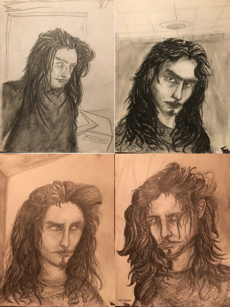
So this was a weird project I did.
First, I drew four individual self-portraits (some of which ended up quite ugly!),
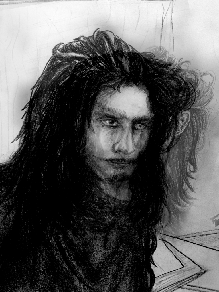
then I stacked them all in Photoshop to create this bizarre layered face,
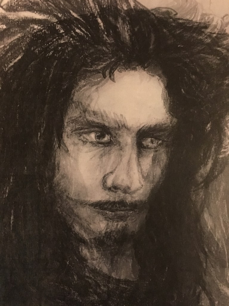
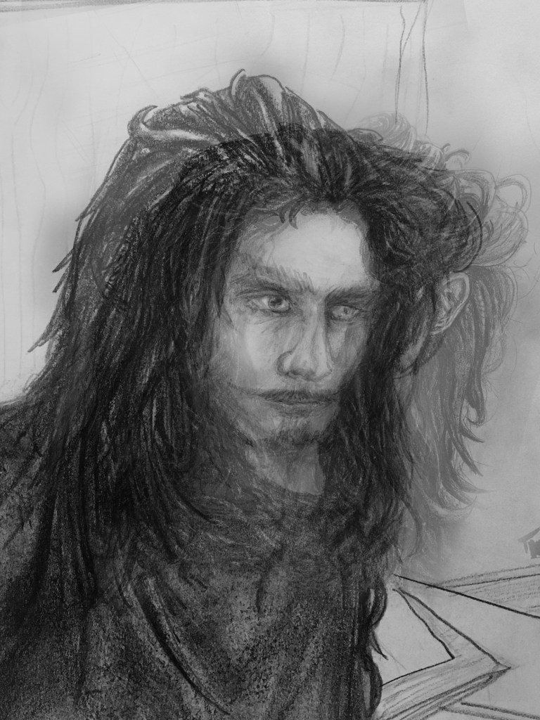

which I then attempted to recreate by hand on 18×24″ drawing paper.
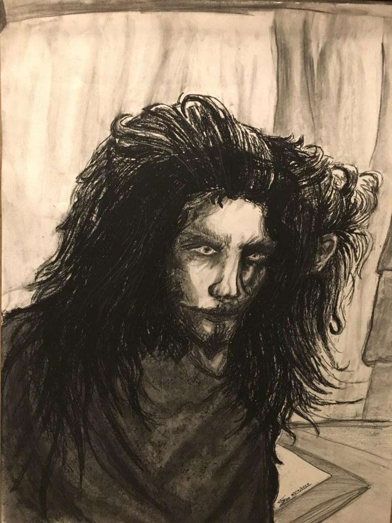
Pretty scary! Why did it make me look like a demon? Why do I look MORE like a demon in my hand-drawn version? Is this actually my true form? Find out in the next episode!

What I’m Listening To:
What I’m Listening To is what music I’m listening to when I do art.
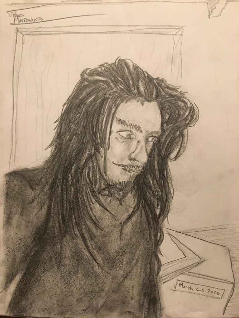
Here’s some stuff from earlier this year (January-February 2020):
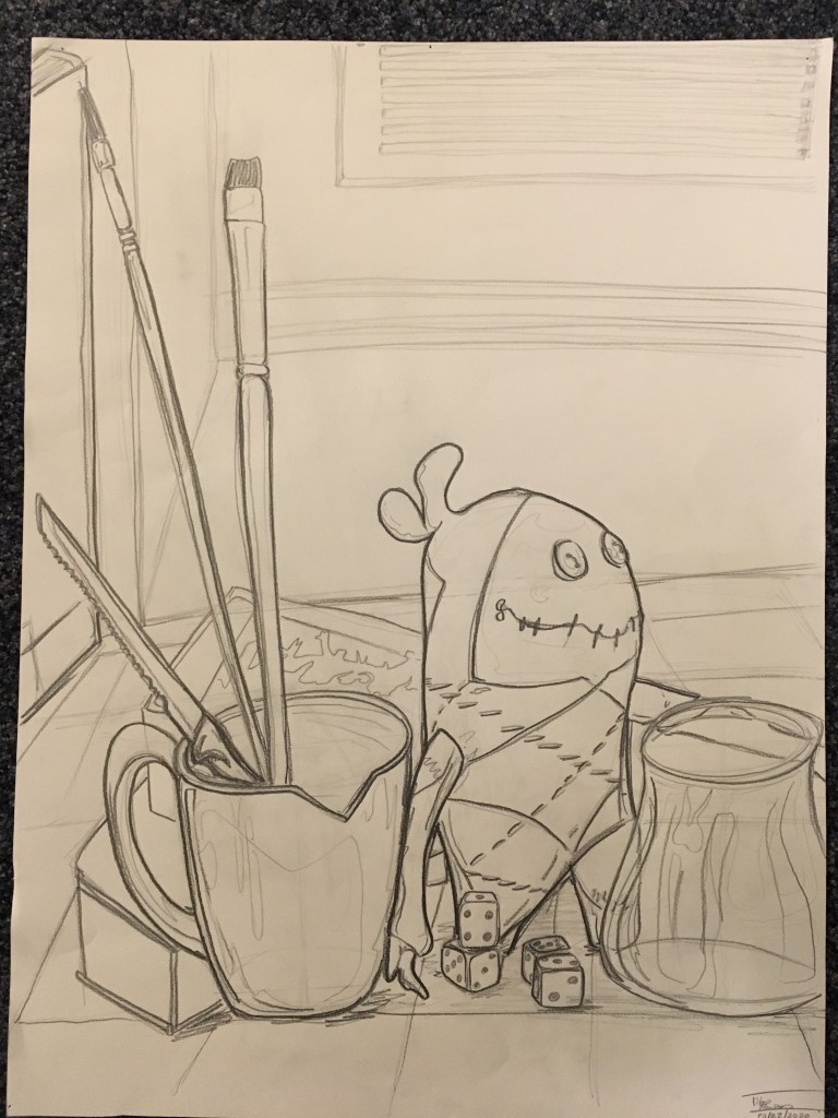
First up is Alfred’s Day Out, a graphite contour study. Aflred’s the gremlin.
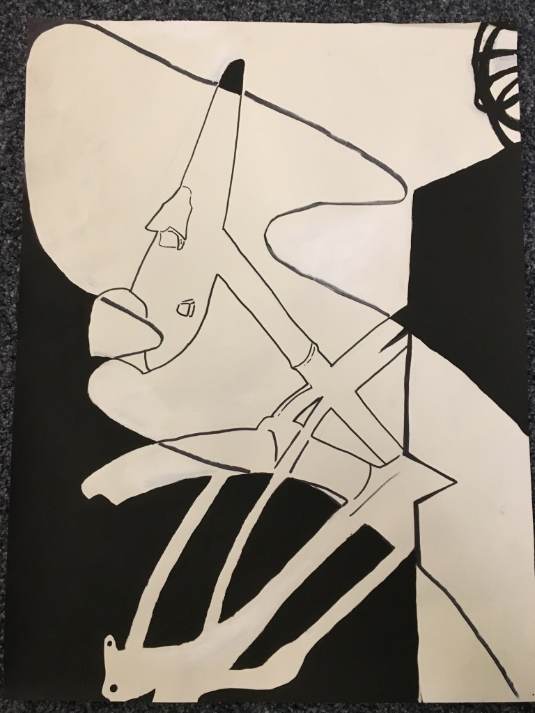
The second drawing is an untitled negative space study of a beat up bicycle chassis created with Sharpie and black+white paint.
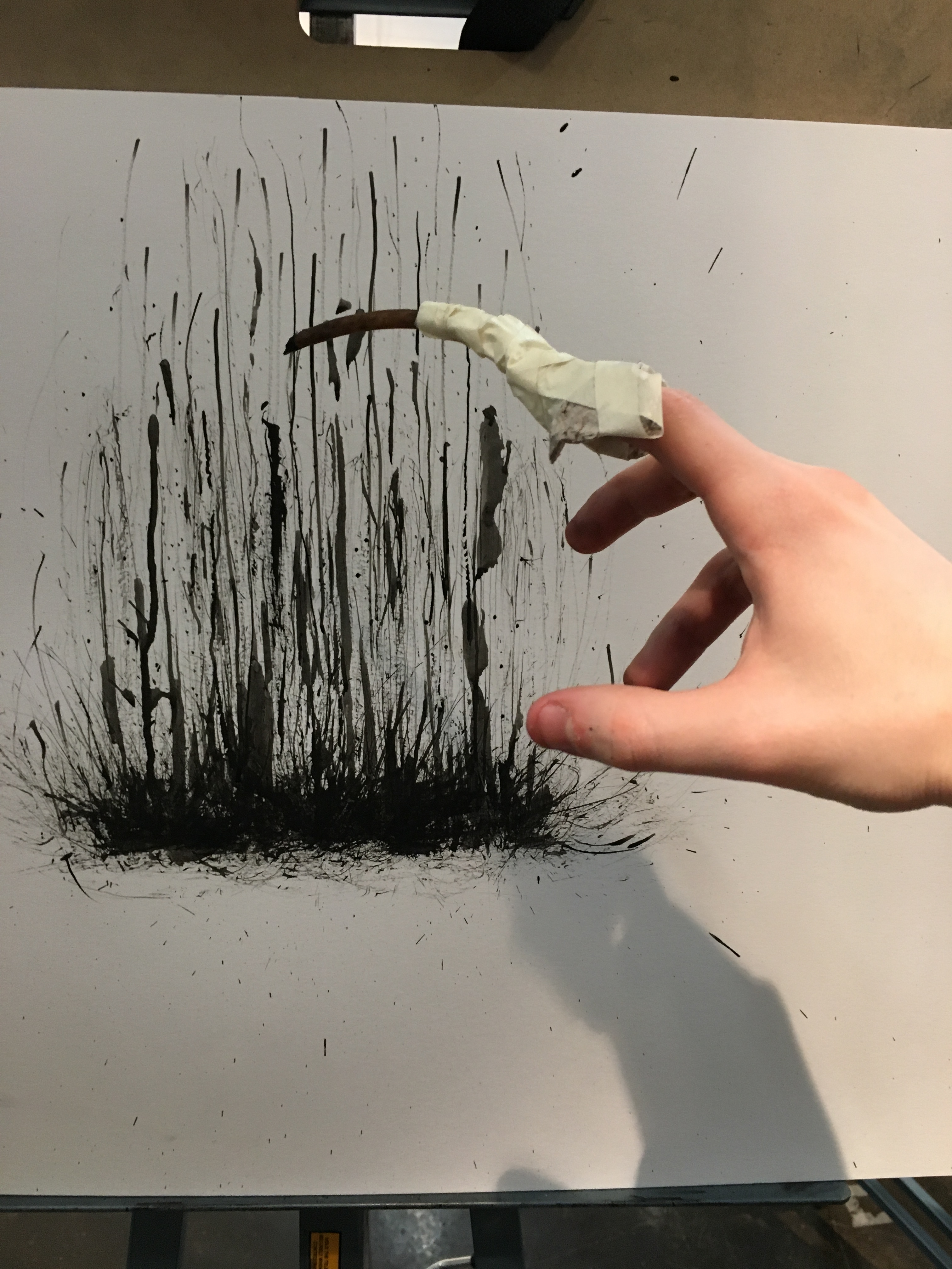
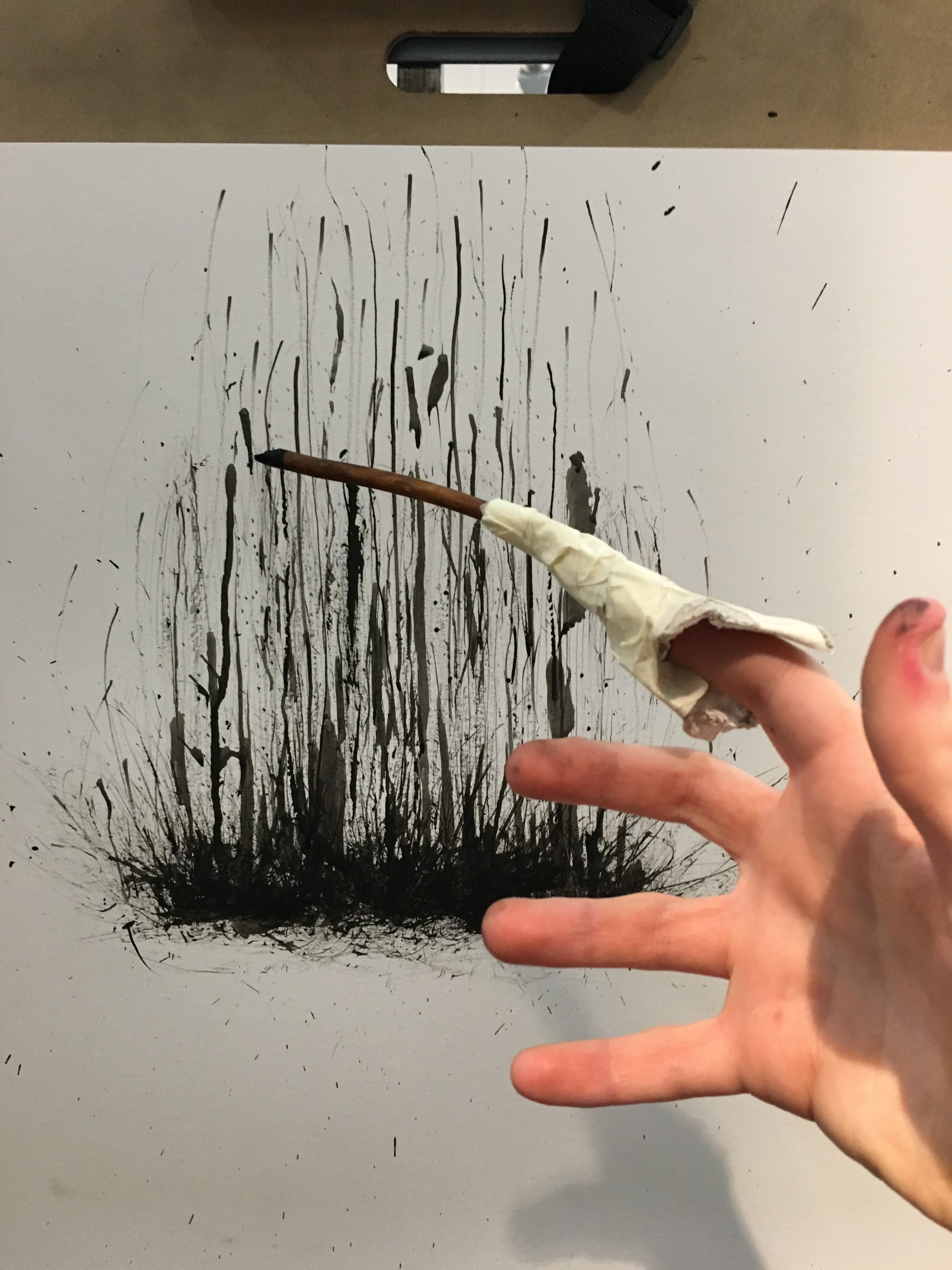
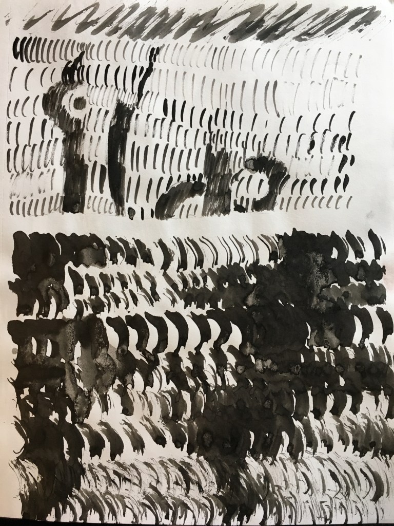
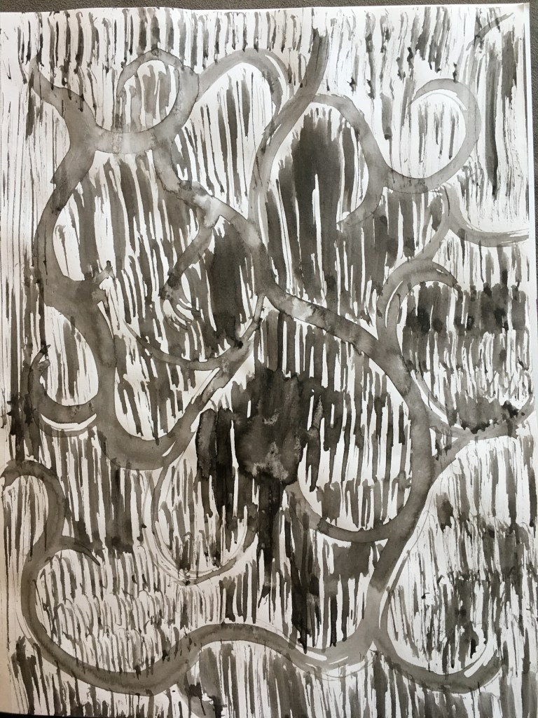
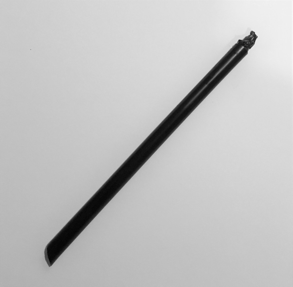
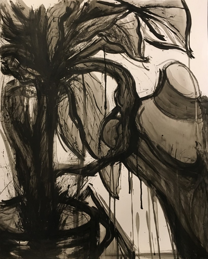
Last is my favorite of the bunch, Mood Inkworks. It was created with a mixture of homemade and conventional brushes. Homemade brushes include a slashed drinking straw, plastic bag shreds on a stick, and a claw.
What I’m Listening To:
What I’m Listening To is what music I’m currently listening to while creating artwork.
Itsa me, Titus.
Why do this?
To be honest, this blog post was just here as a stock “iNTRoDuCe YouRSeLF!” prompt and I couldn’t bother to delete it, so here we are.